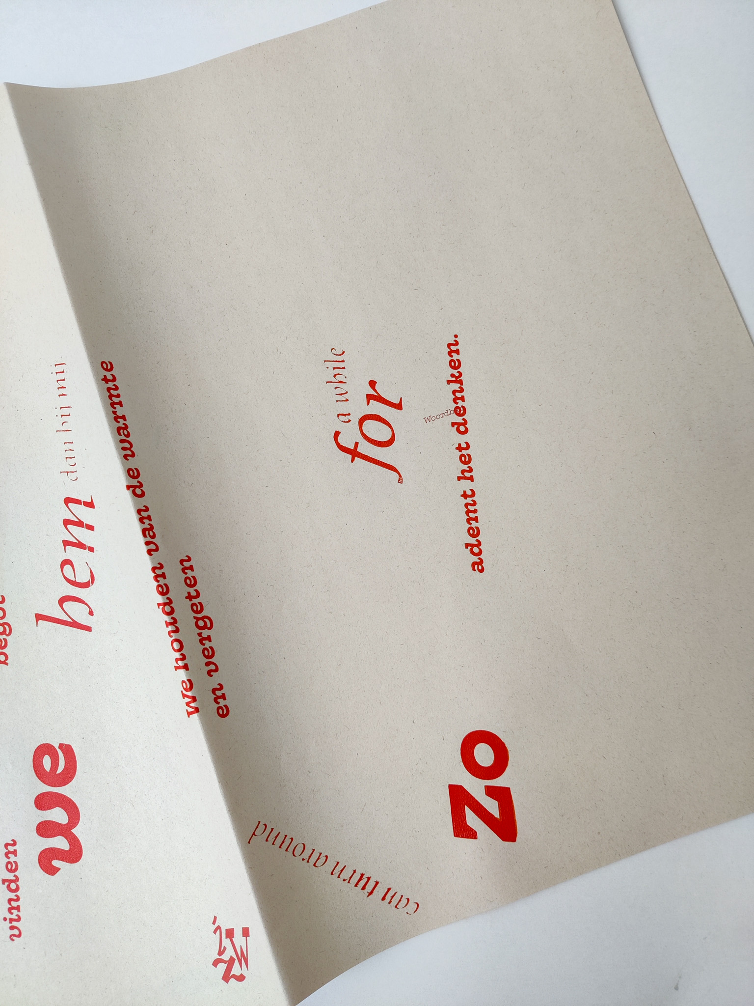
Legibility is circumstantial
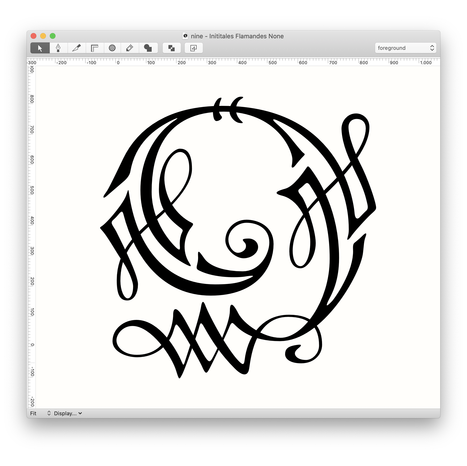
Q eft dat v dunckt at v offezanden En at ghy te vergheef bidt met ghebouwn hanen Oft soo Narcissu hem plach te veriolijsen ghen Waeom beroemdy v mijn soo ghy seght ooz minn ls tafel rinn n beroy guten Roffiann giln n lichte schuyten Soo de pauw in sijn schoonheyt he verheft b vla Oft soo Narcissu hem plach te veriolijsen ghen ie in sijn schoon persoonheyt oock hadde behagen Soo behaeght v self werck welck ghy sult pzijsen En ander constighe wercken afwijsen Mar ghy Zoyle wout ghy een peysen oft incken
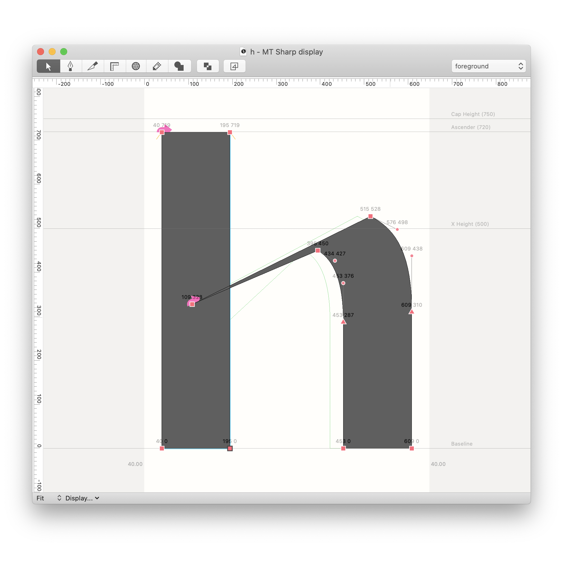
 MT sharp
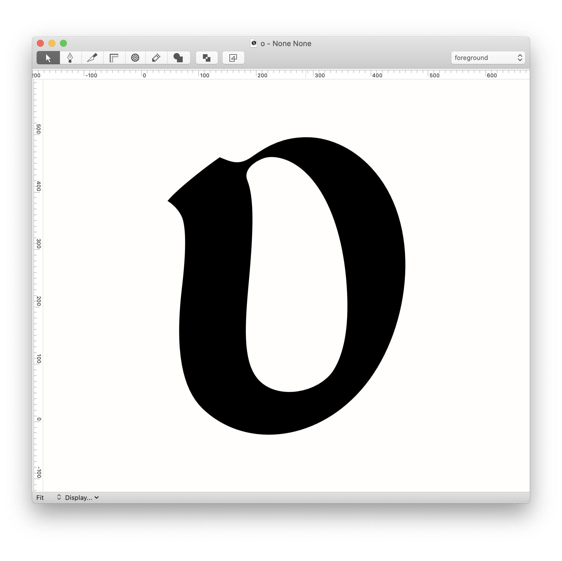
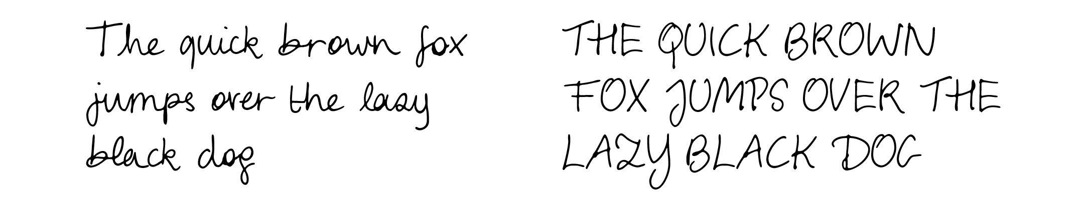
The quick brown fox jumps over the lazy black dog
MT no more grids condensedThe quick brown fox jumps over the lazy black dog
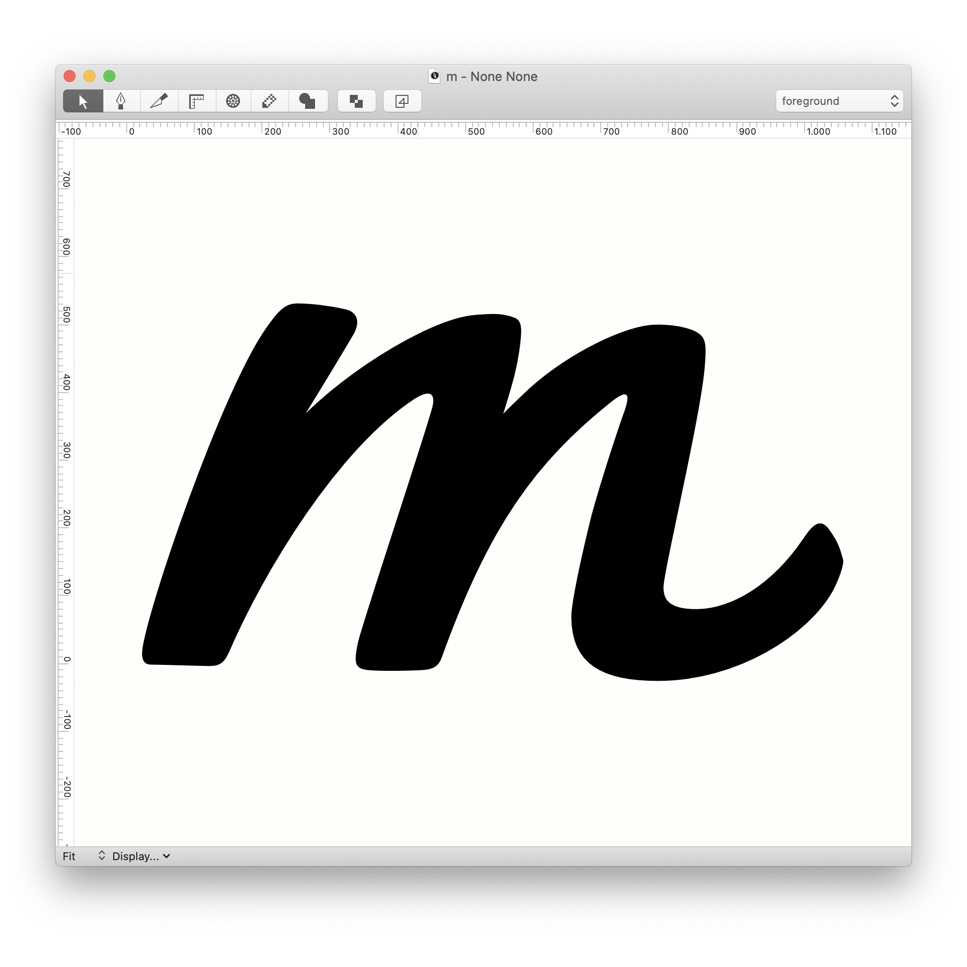
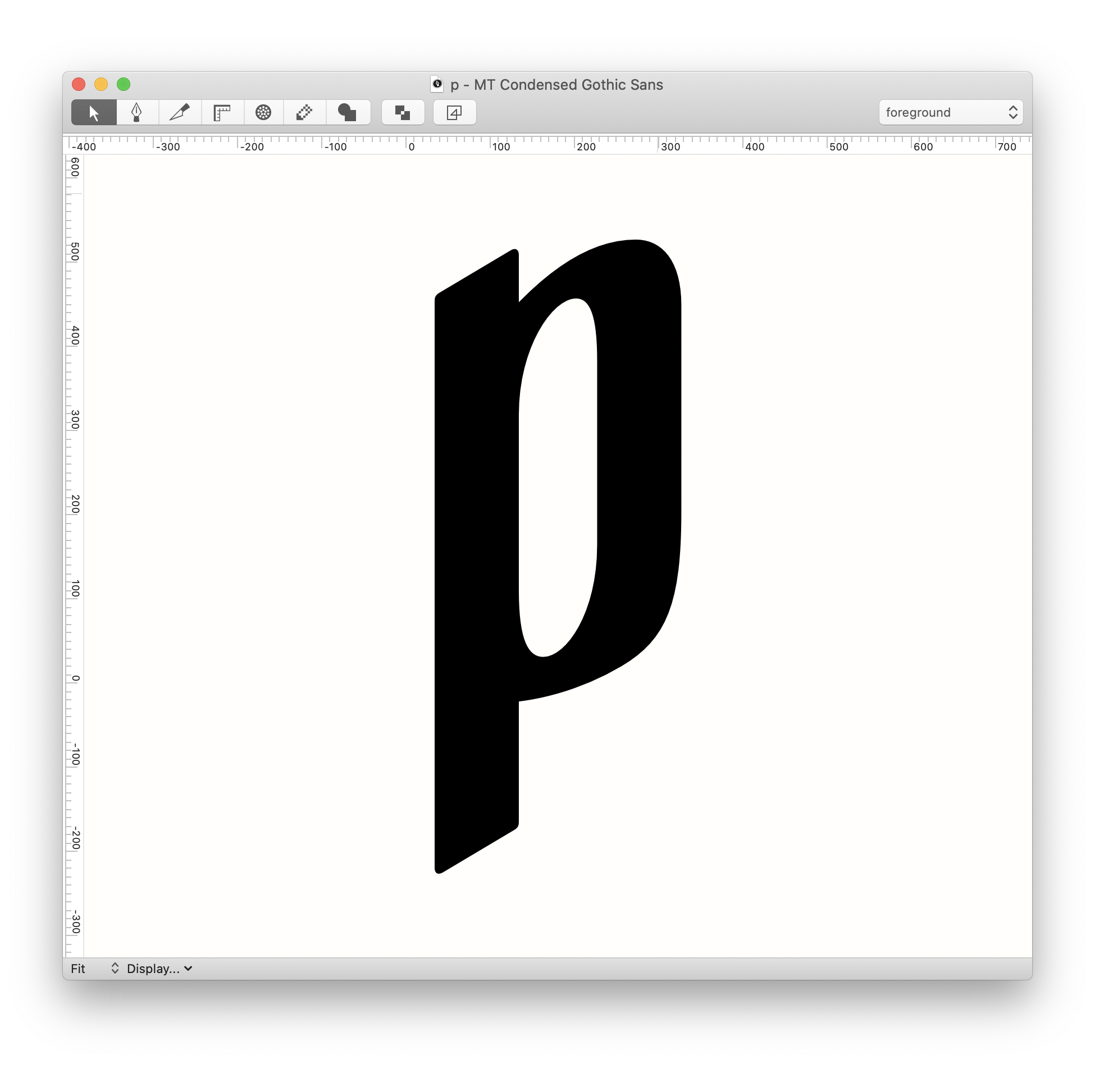
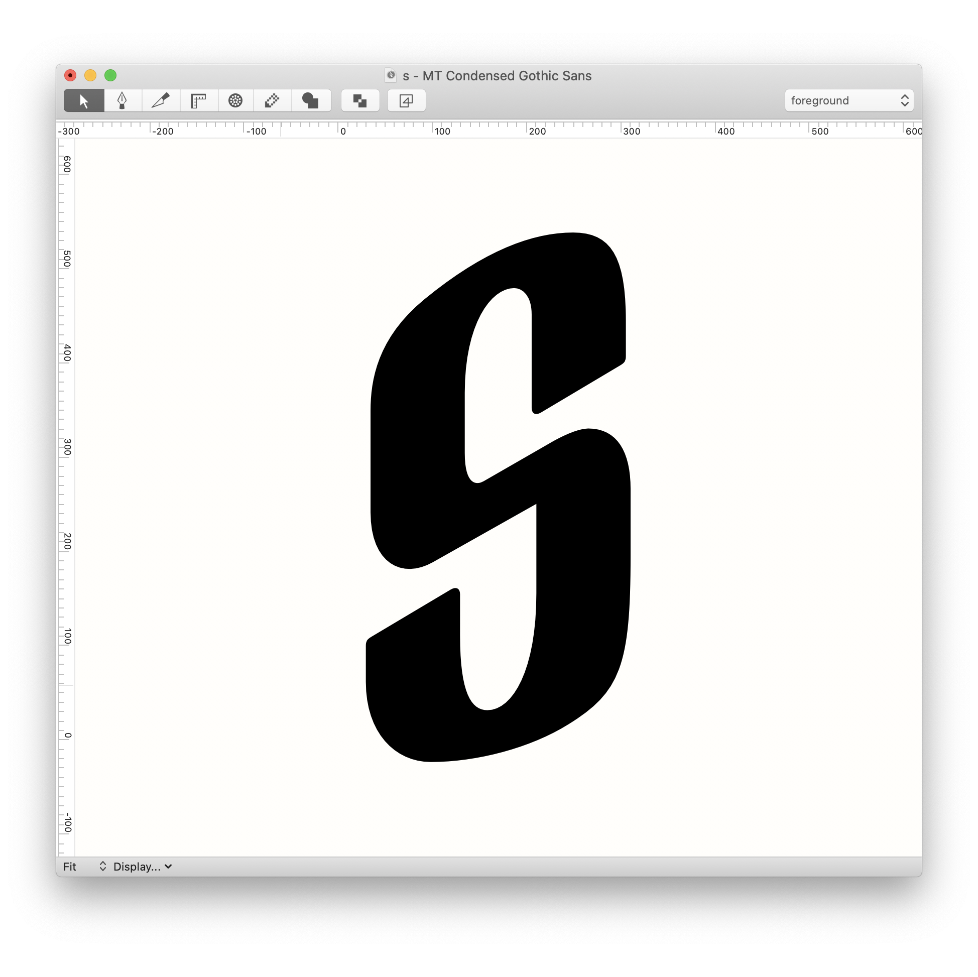
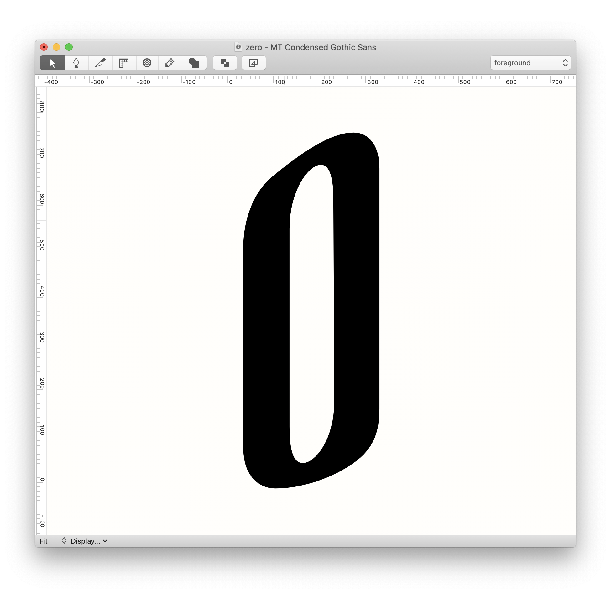
MT condensed gothicThe quick brown fox jumps over the lazy black dog
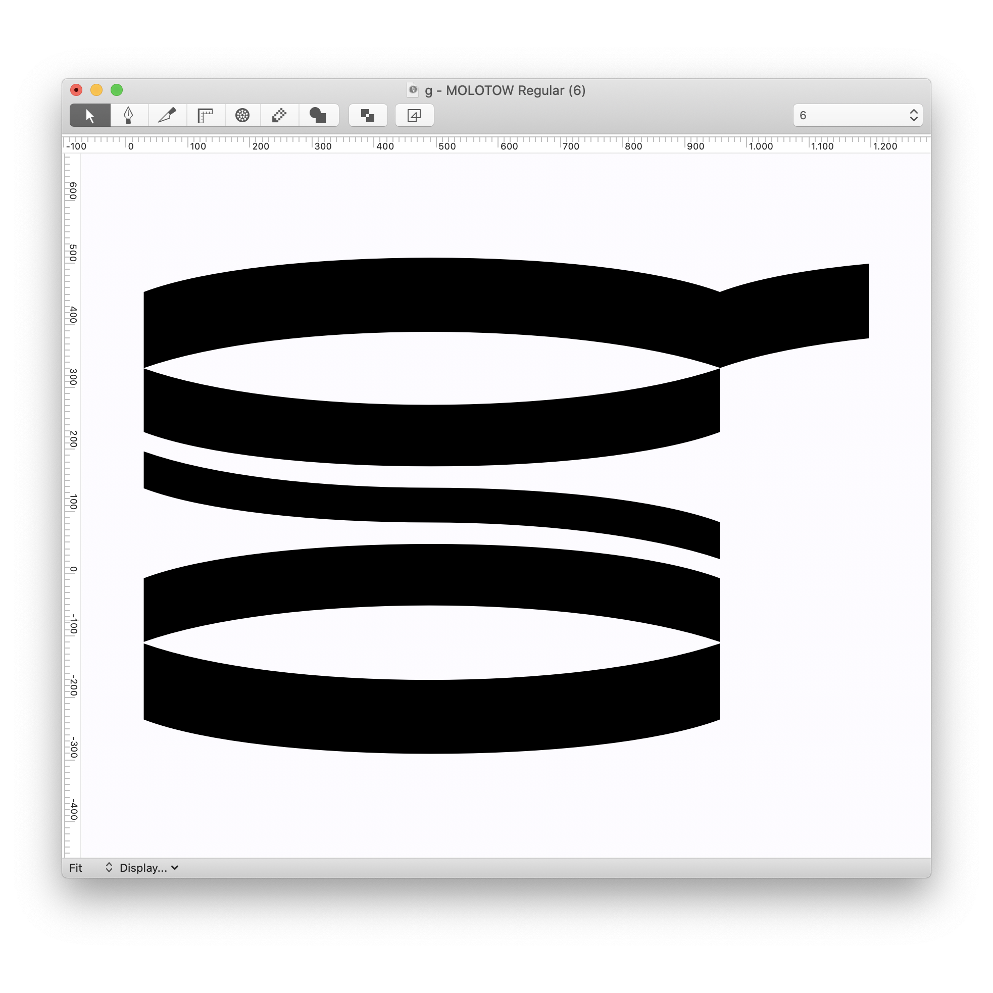
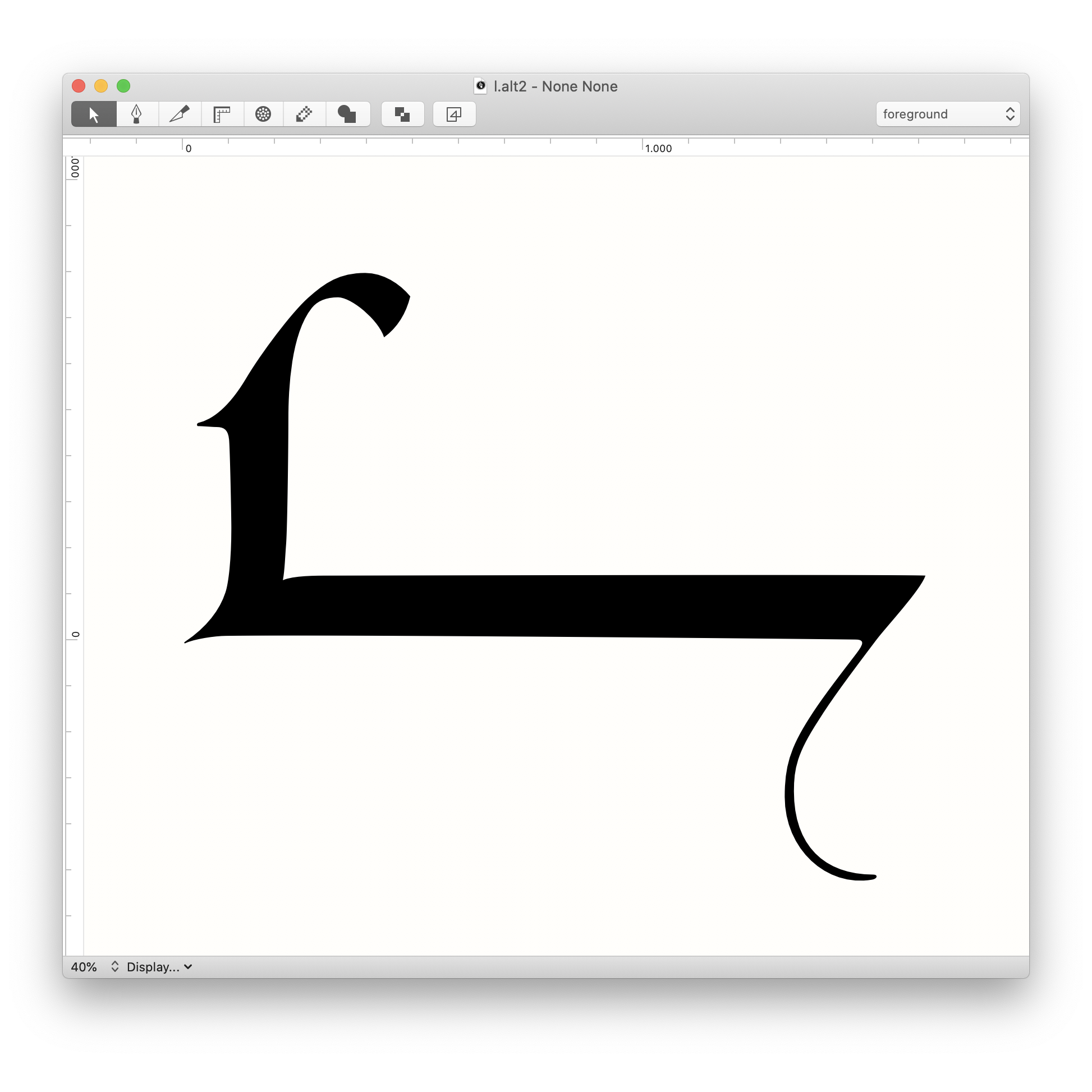
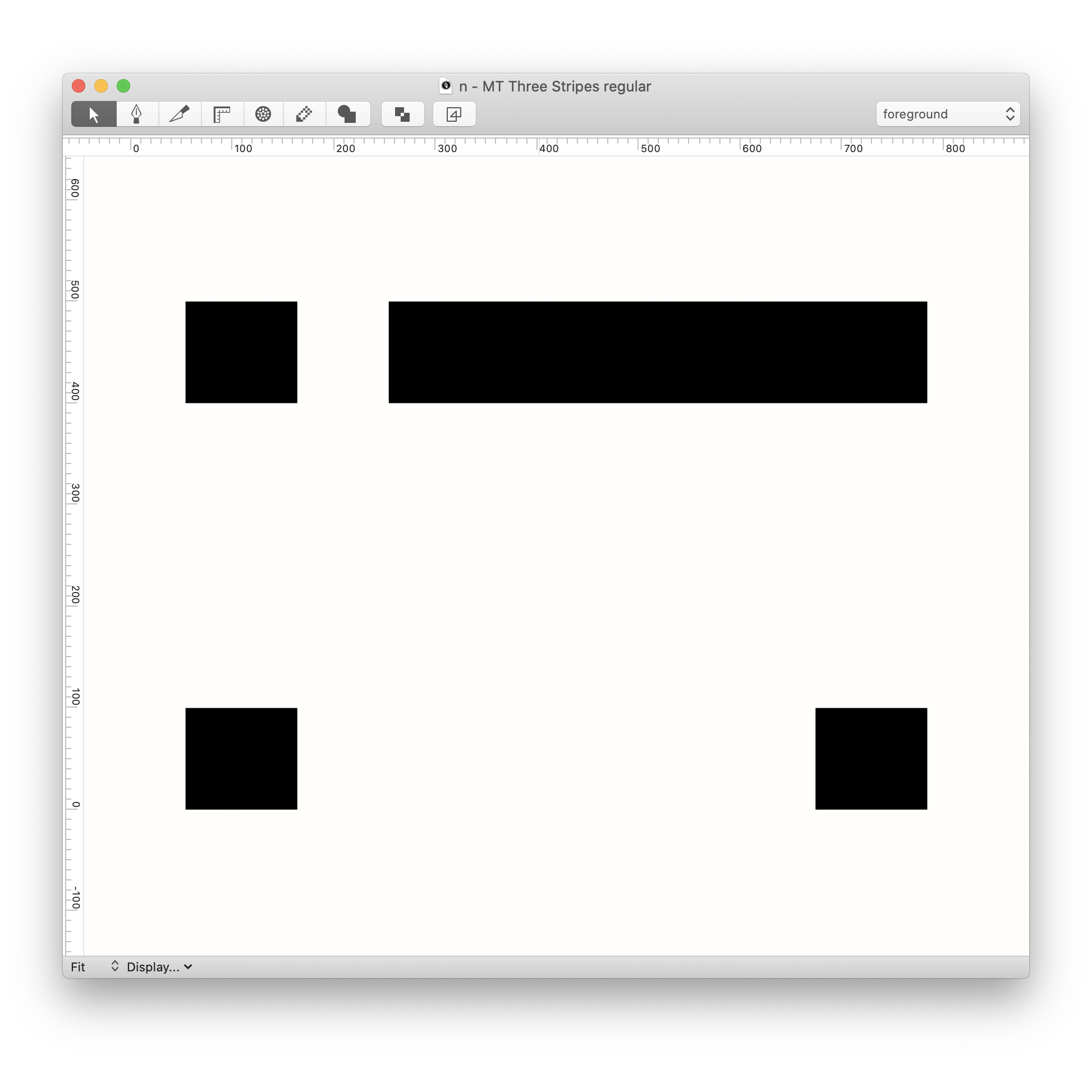
MT three stripesThe quick brown fox jumps over the lazy black dog
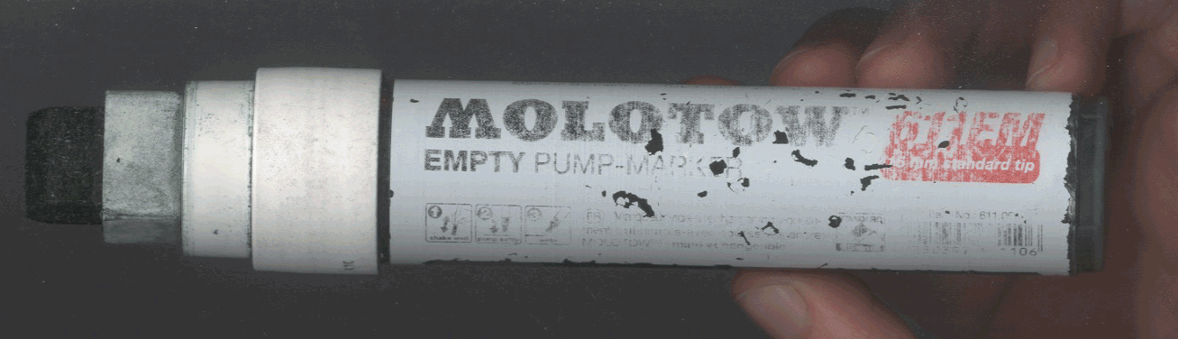
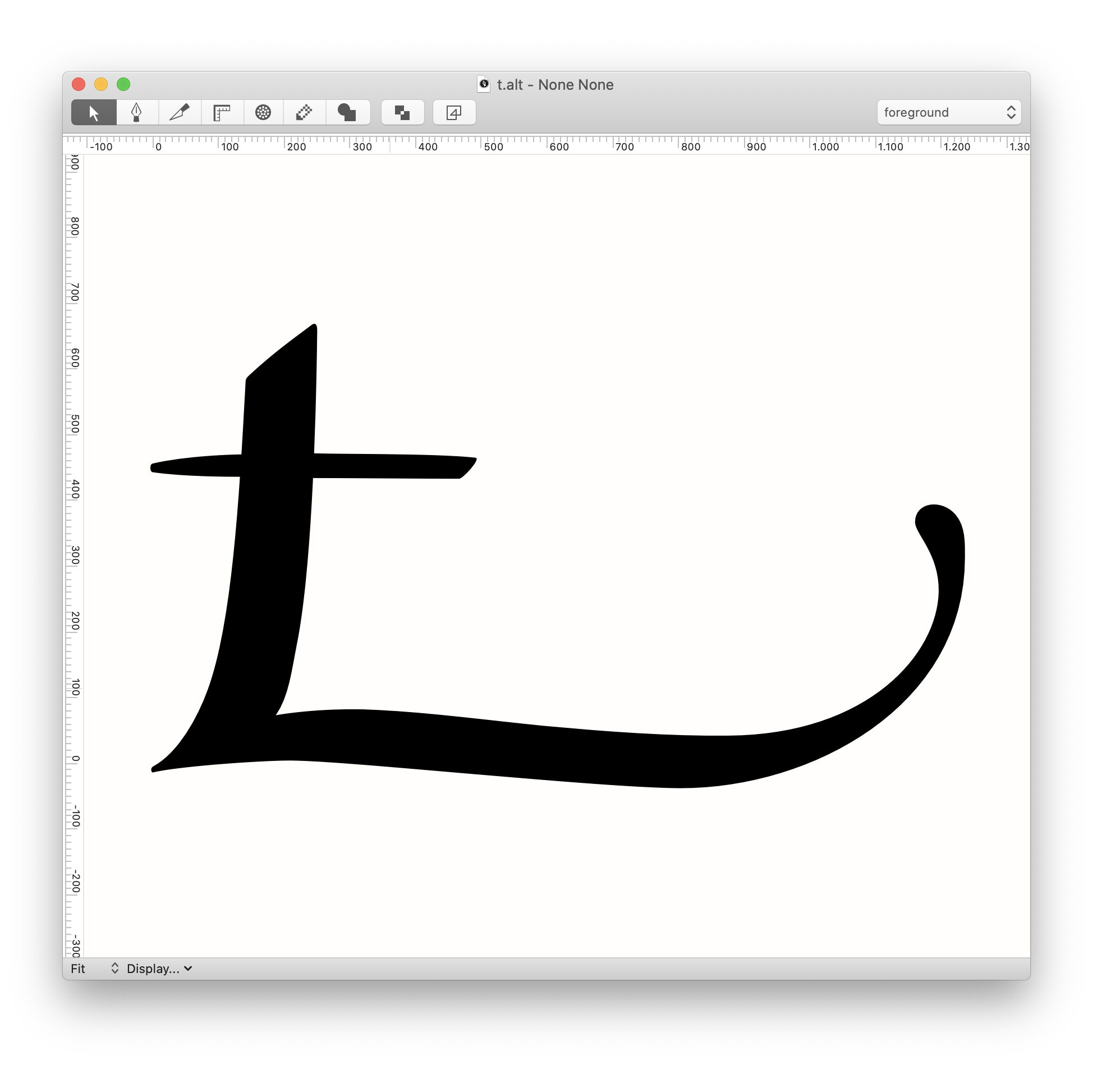
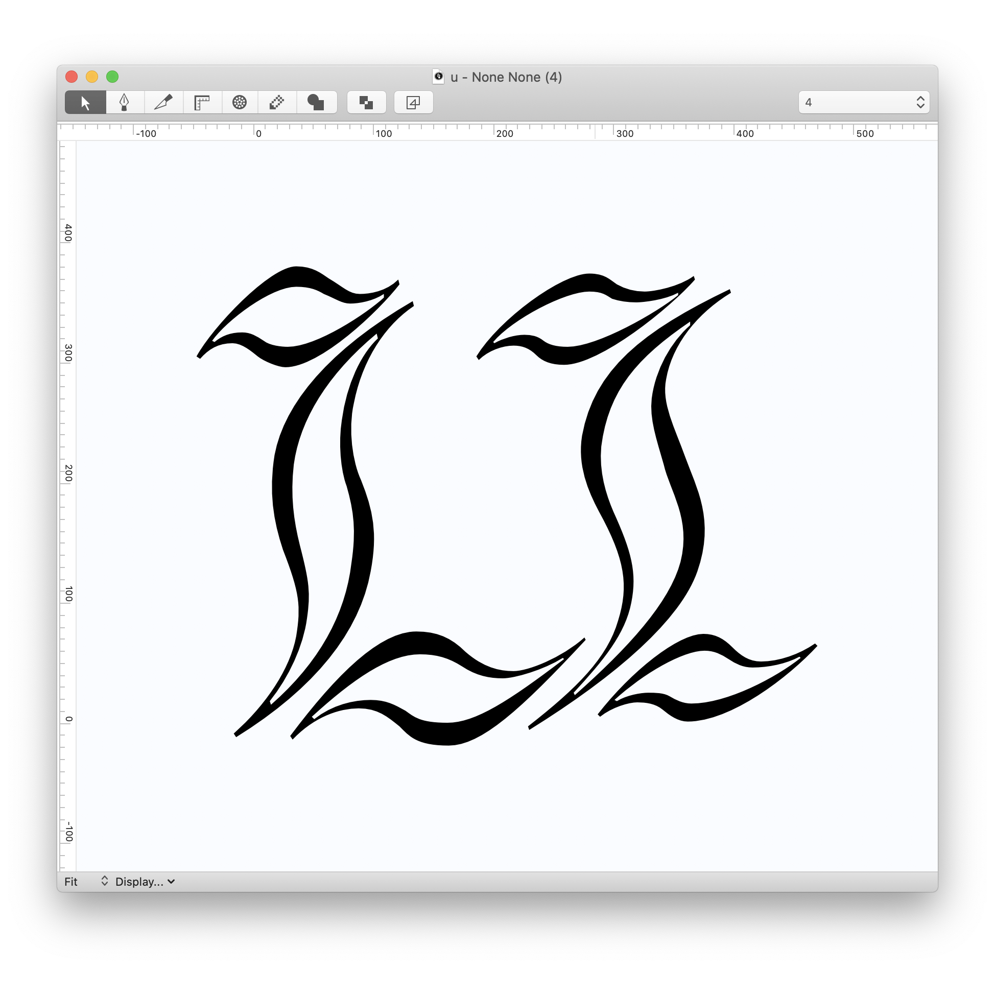
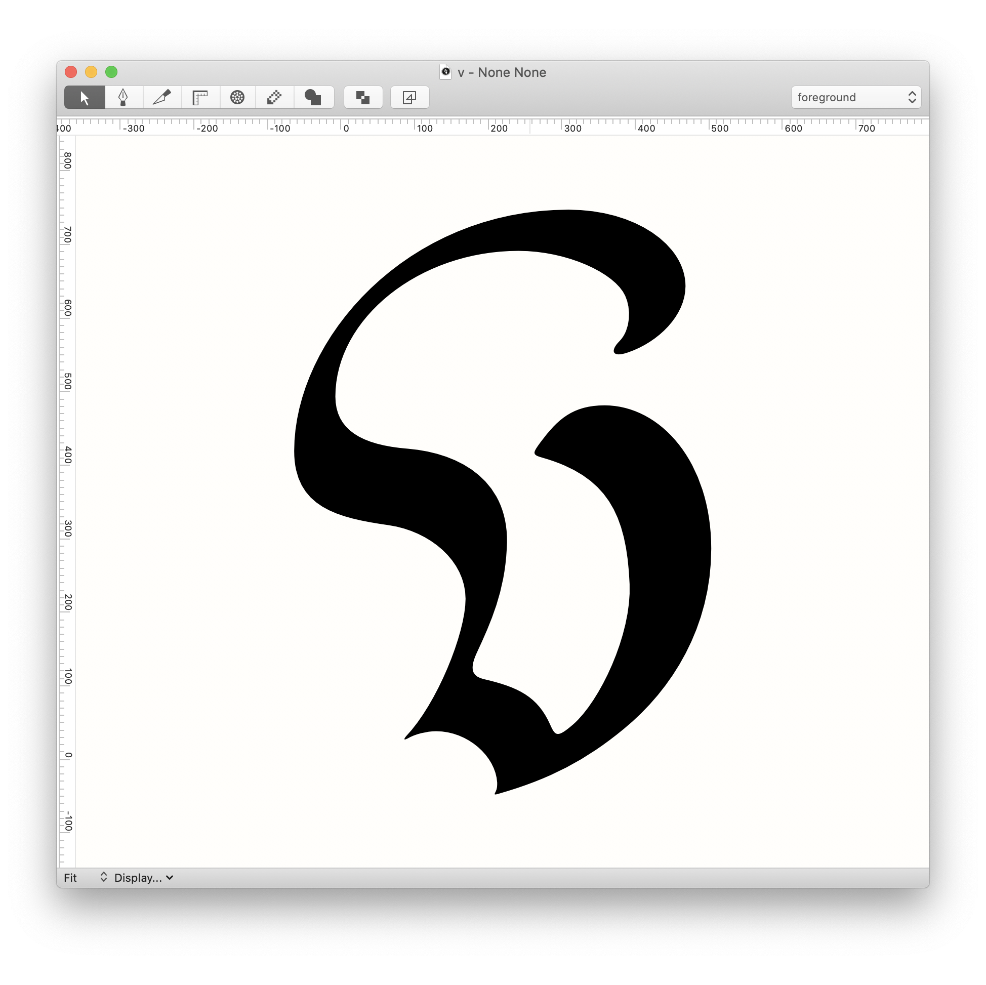
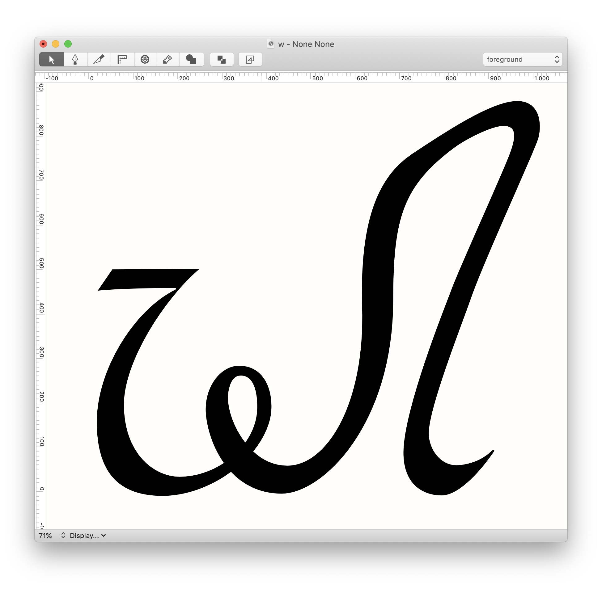
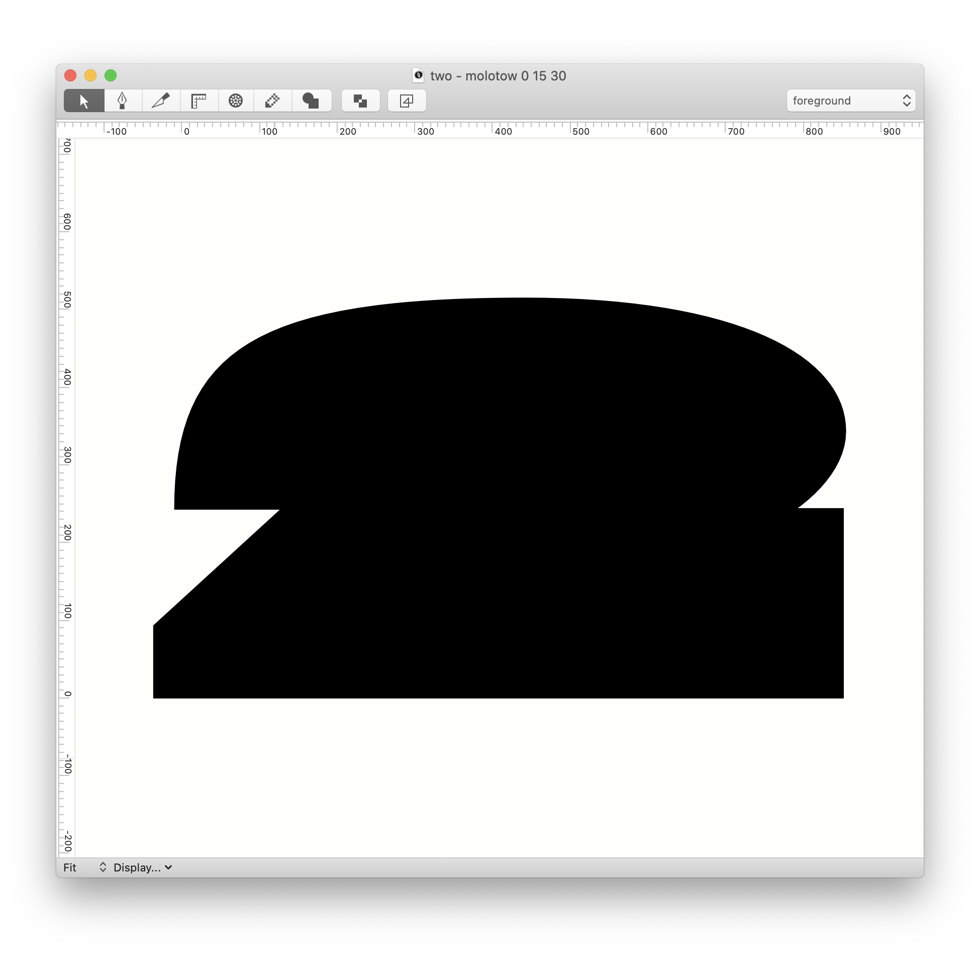
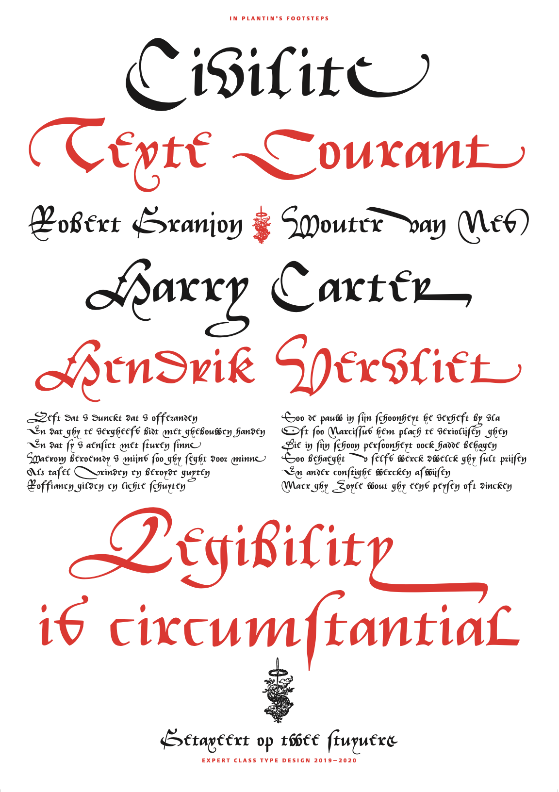
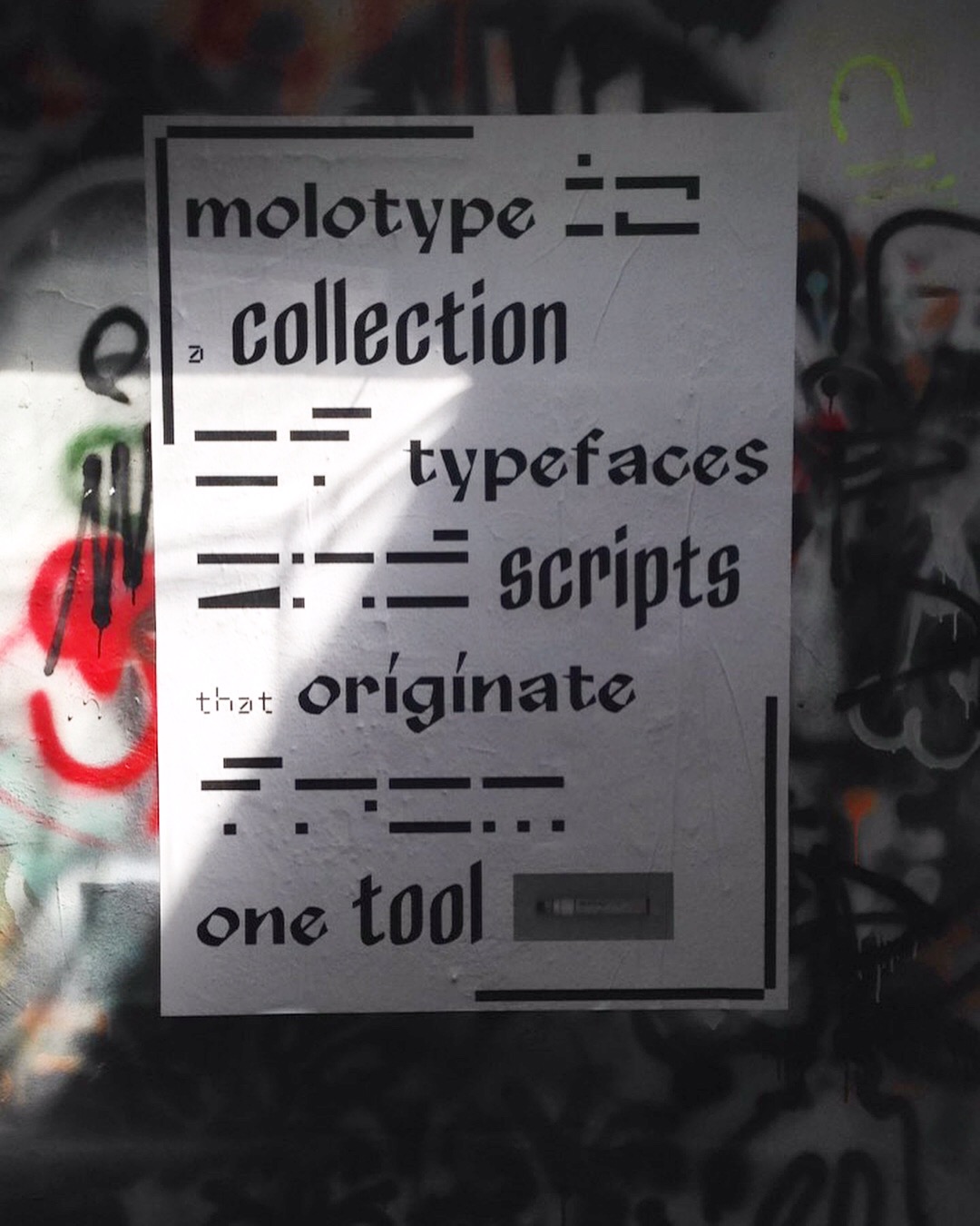
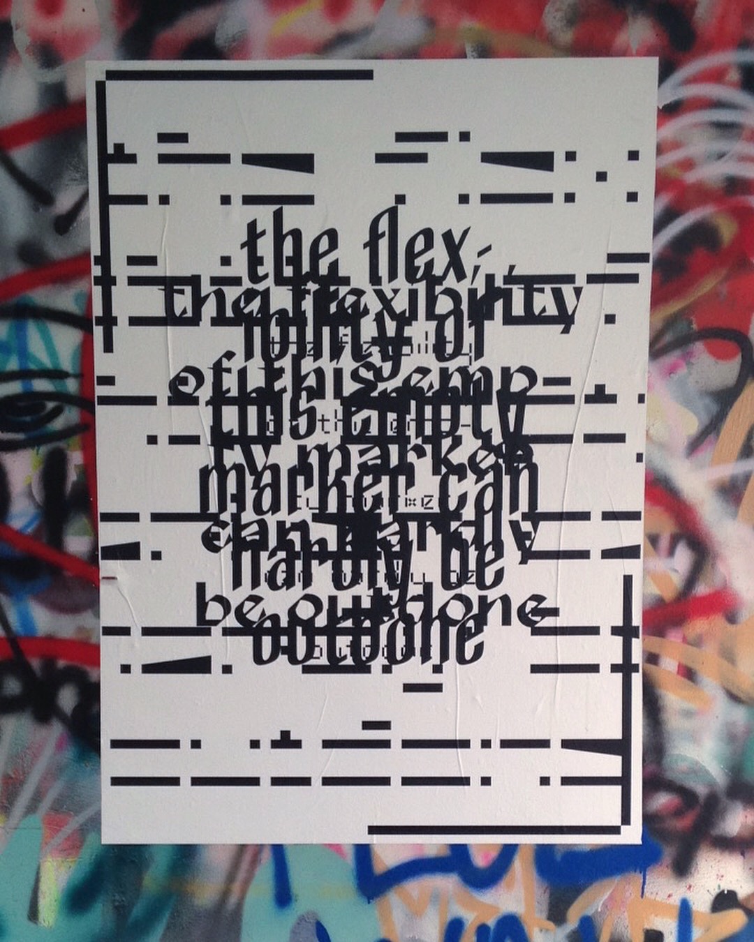
MOLOTYPE is a fictional type foundry that consists of typefaces that all originate from the same writing tool, a 15mm MOLOTOW 611EM Empty Pump Marker. It is the start of a research on how (writing) tools could be appropriated to be used to make work it isn't intended for, specifically in the field of type design and calligraphy. With MOLOTYPE I used a street marker as a tool to make typefaces. As such I also presented it in a small space on campus that is filled with graffiti
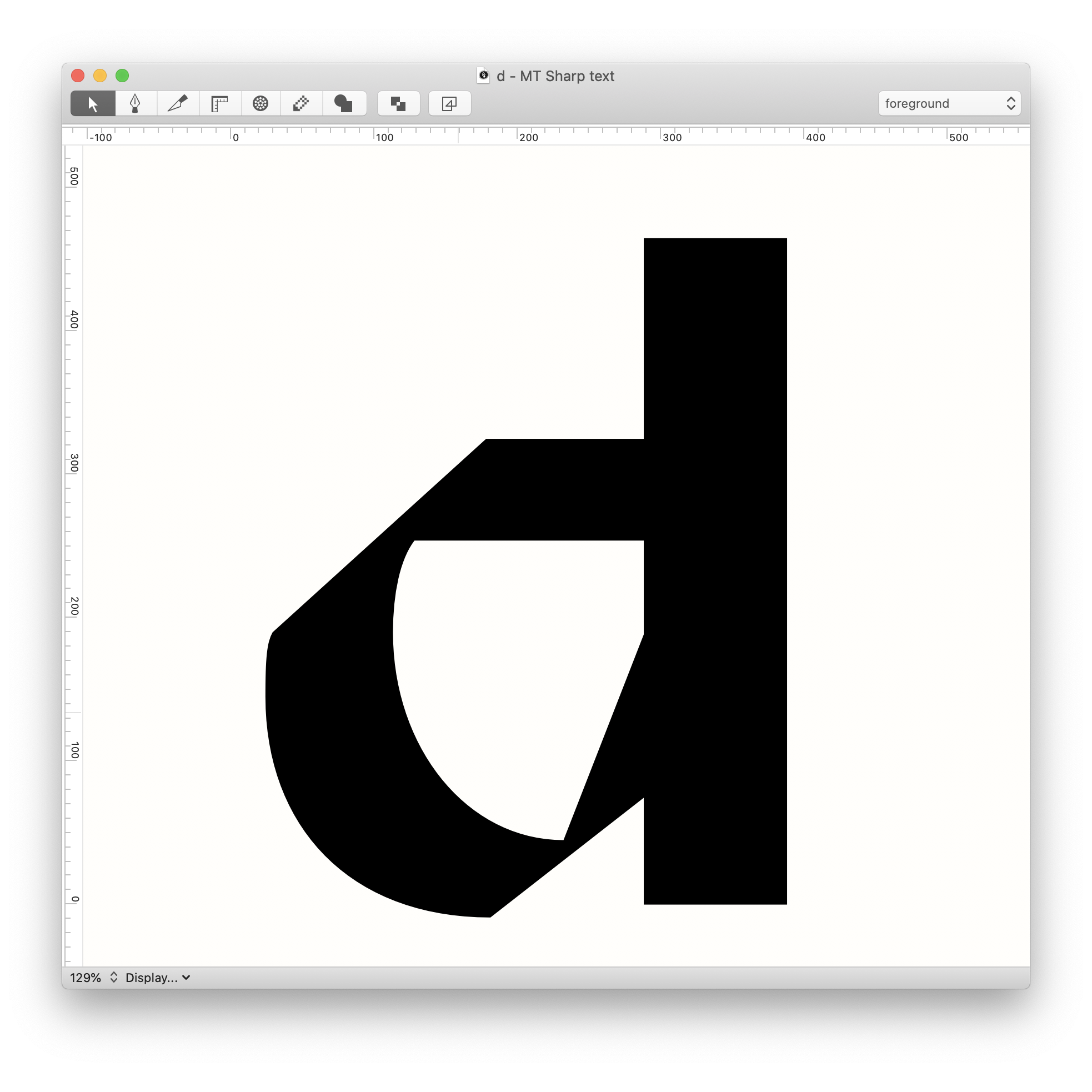
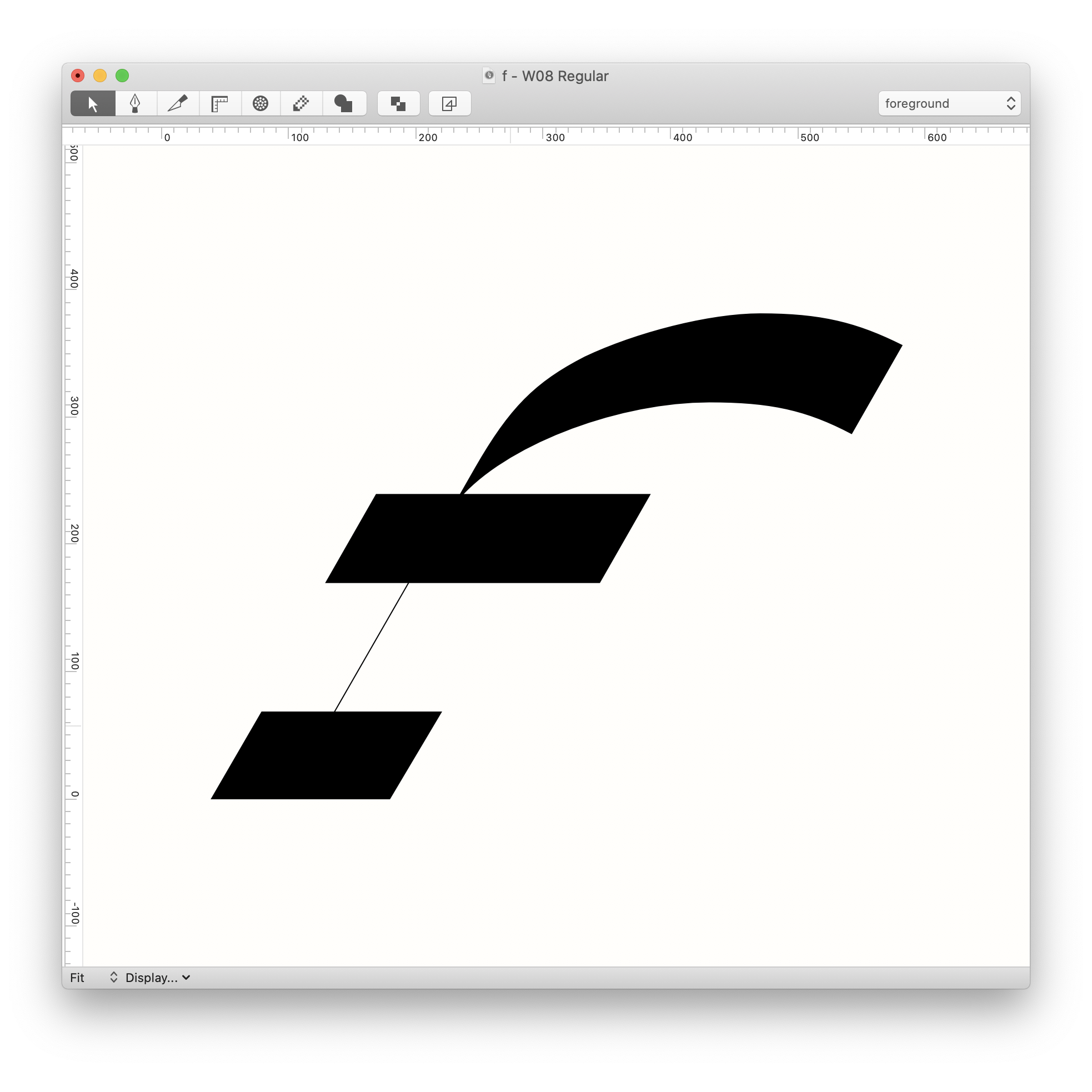
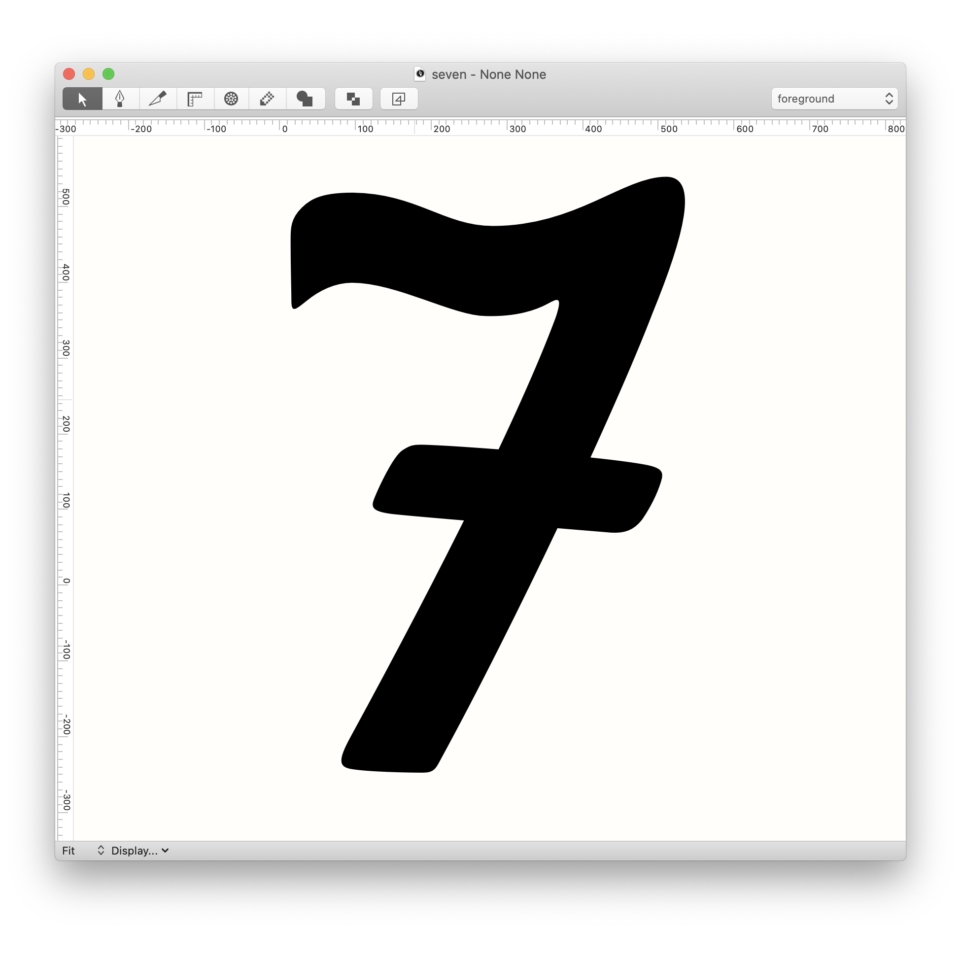
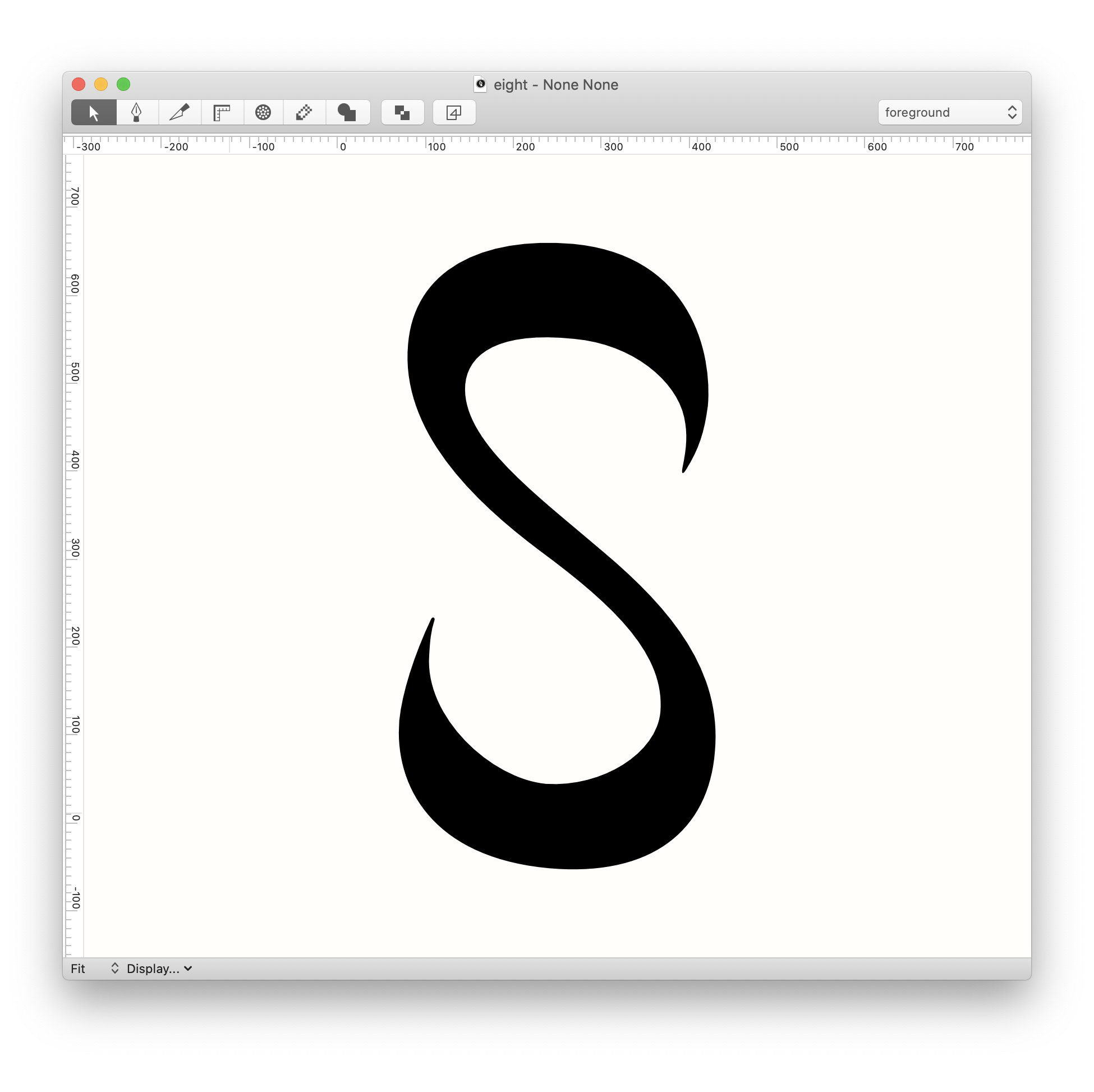
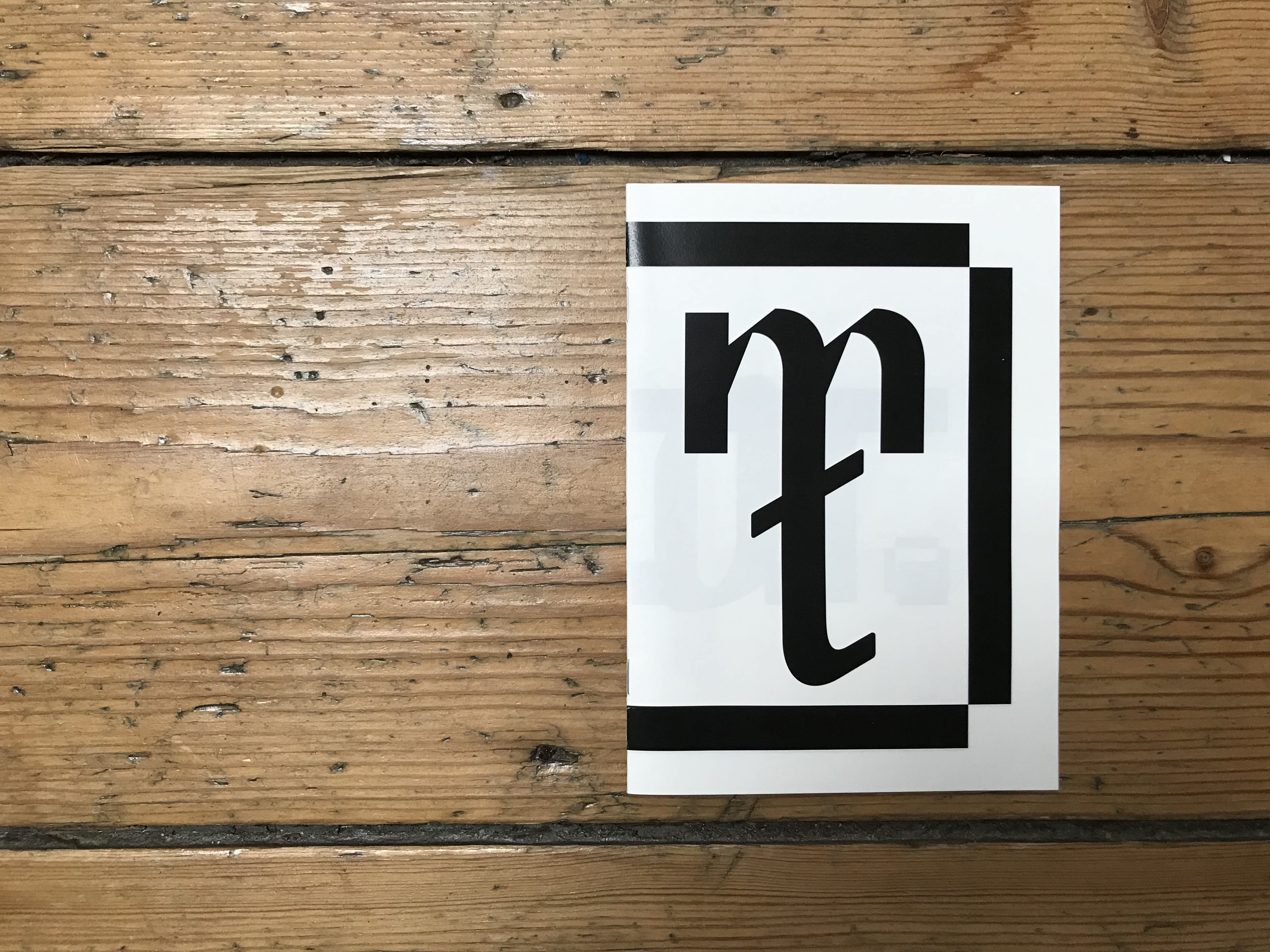
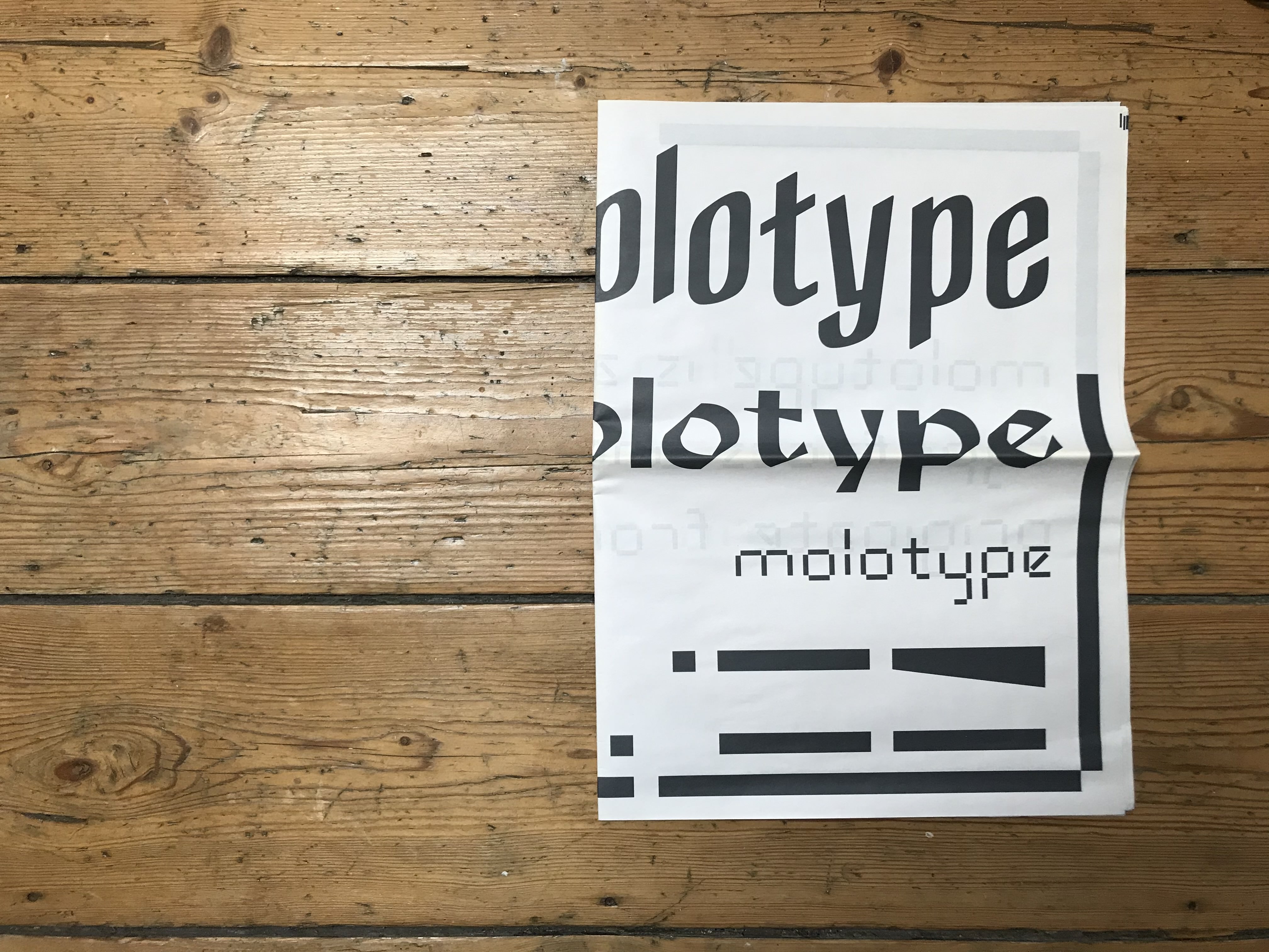
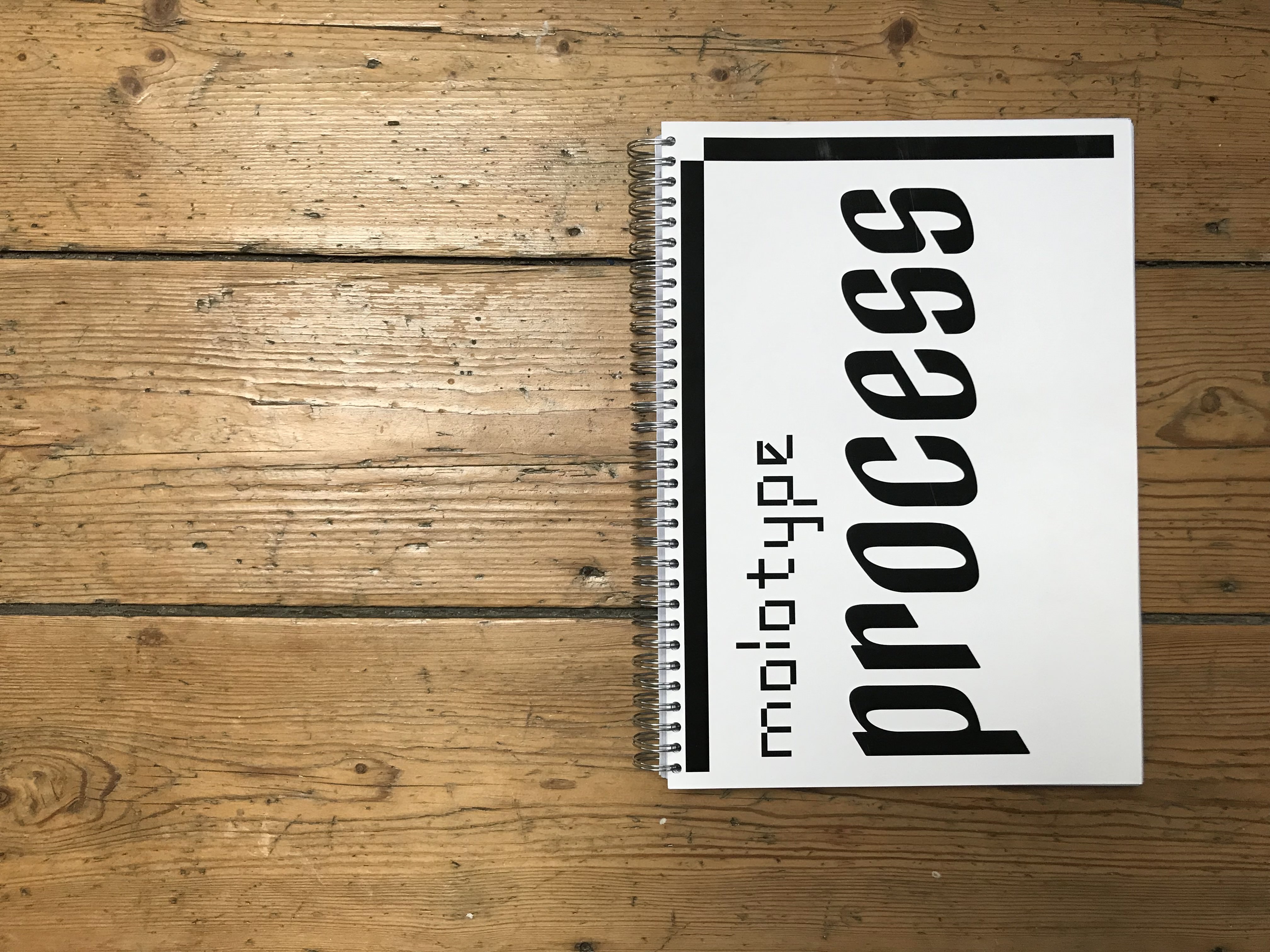
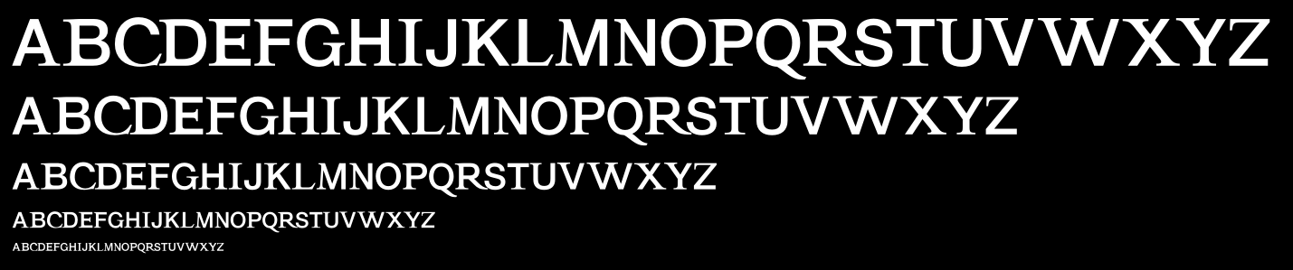
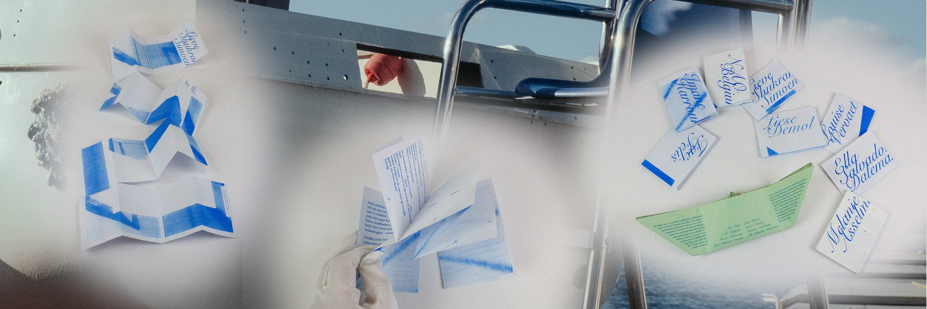
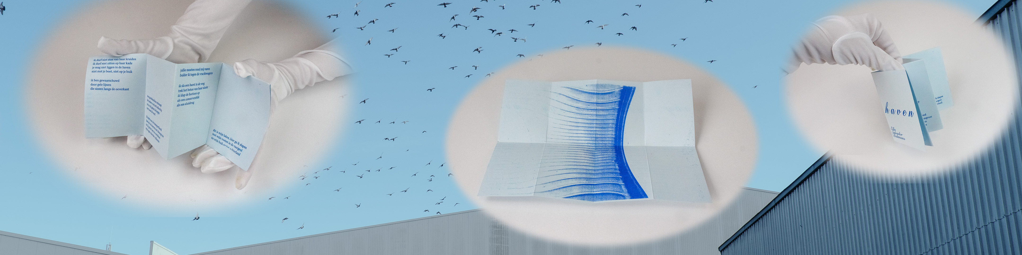
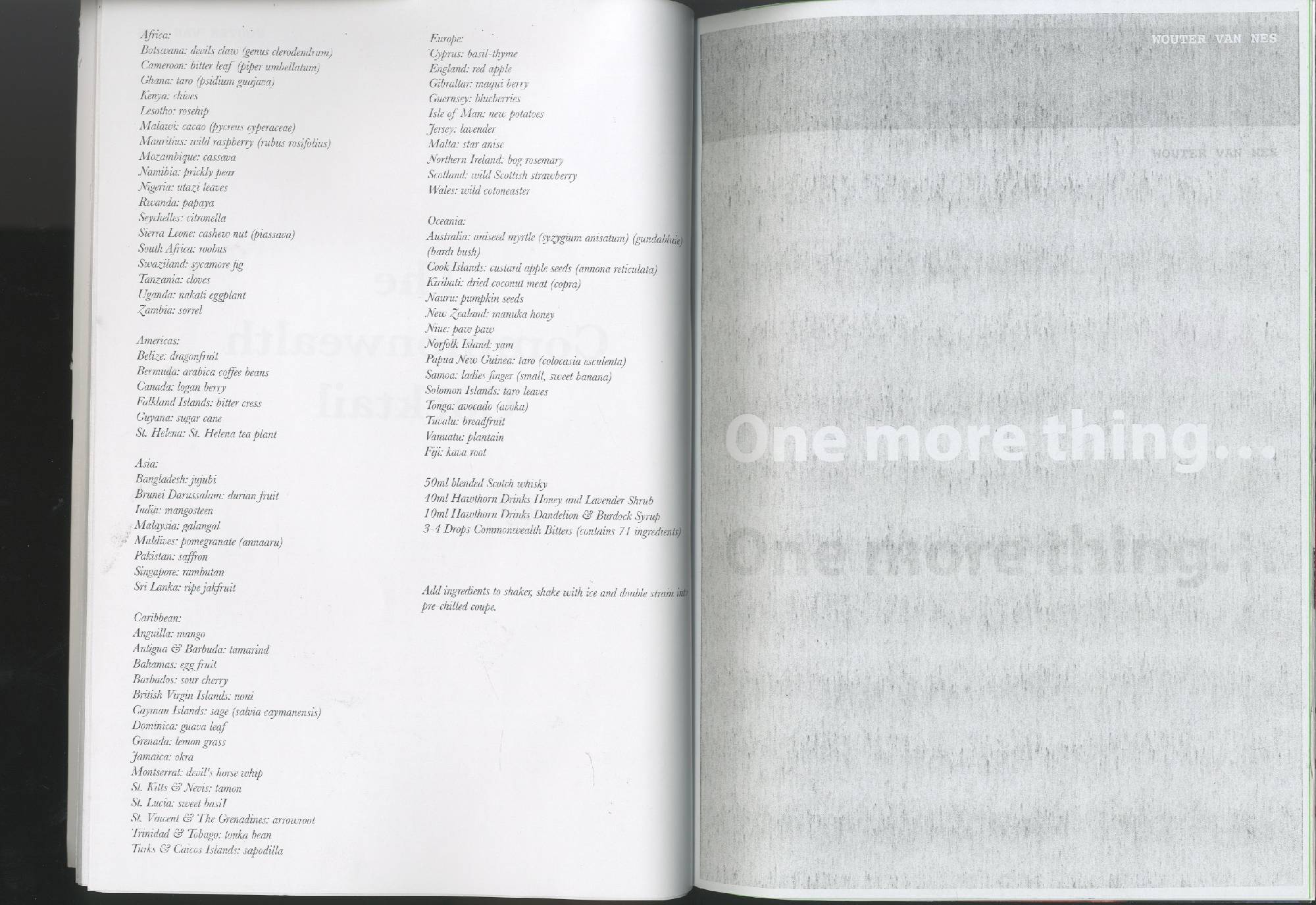
MOLOTYPE consists out of four typefaces. 'MT no more grids', the smallest possible typeface possible with the Molotow marker. 'MT Three Stripes', a typographic play with three horizontal stripes. 'MT Sharp', which utilizes the speed of upstrokes and the slowness of downstrokes to construct a high and sharp contrast. Finally there is 'MT Condensed Gothic', a very condensed face where the slope of the marker is visible through its contrast and stroke endings. To show these four typefaces there are a couple specimens that work together as a whole by displaying the typefaces at the same size as the marker would draw them. These specimens are three A0 posters, a paper (375mm x 520mm), a small A5 booklet and a postcard. Finally I also made the procesbook to show some sketches and provide some visual background information to the project.
Download free paper specimens Download free poster specimens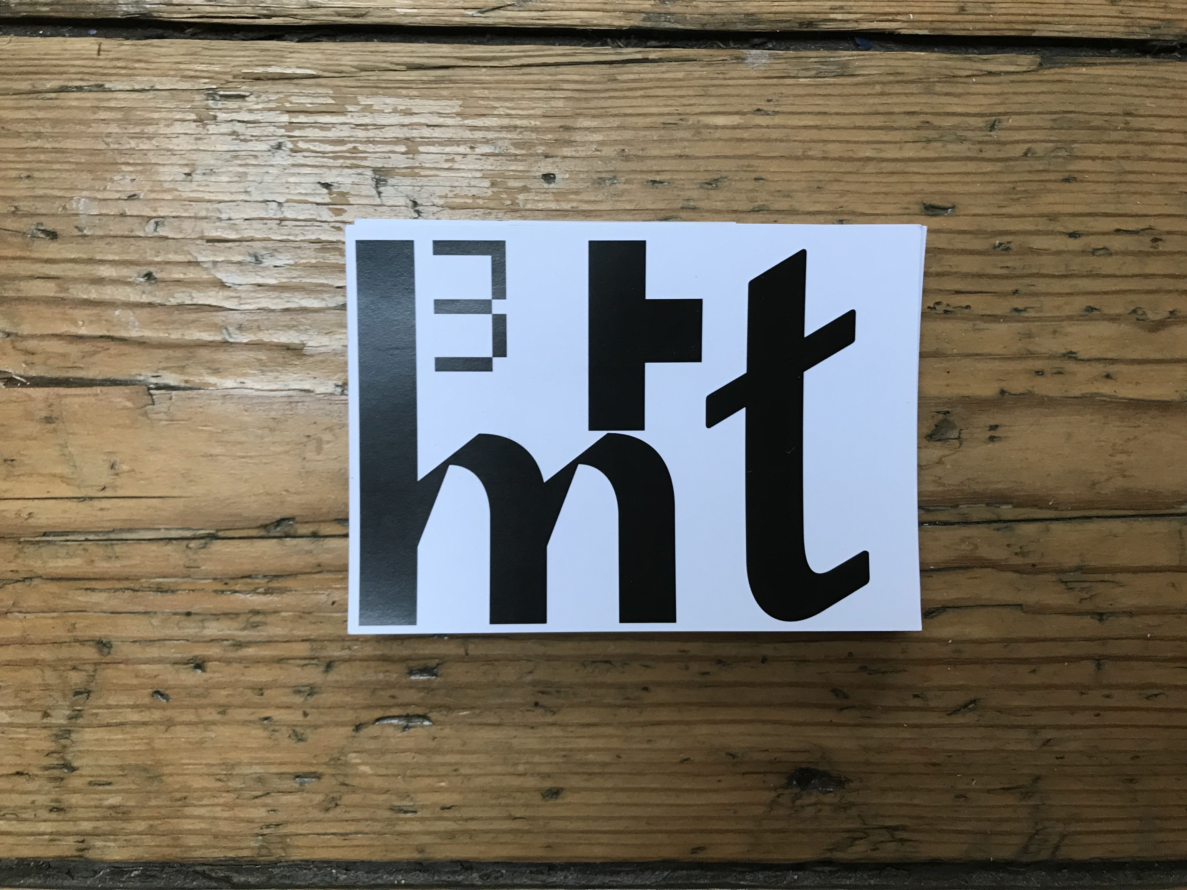
 ———————————————————
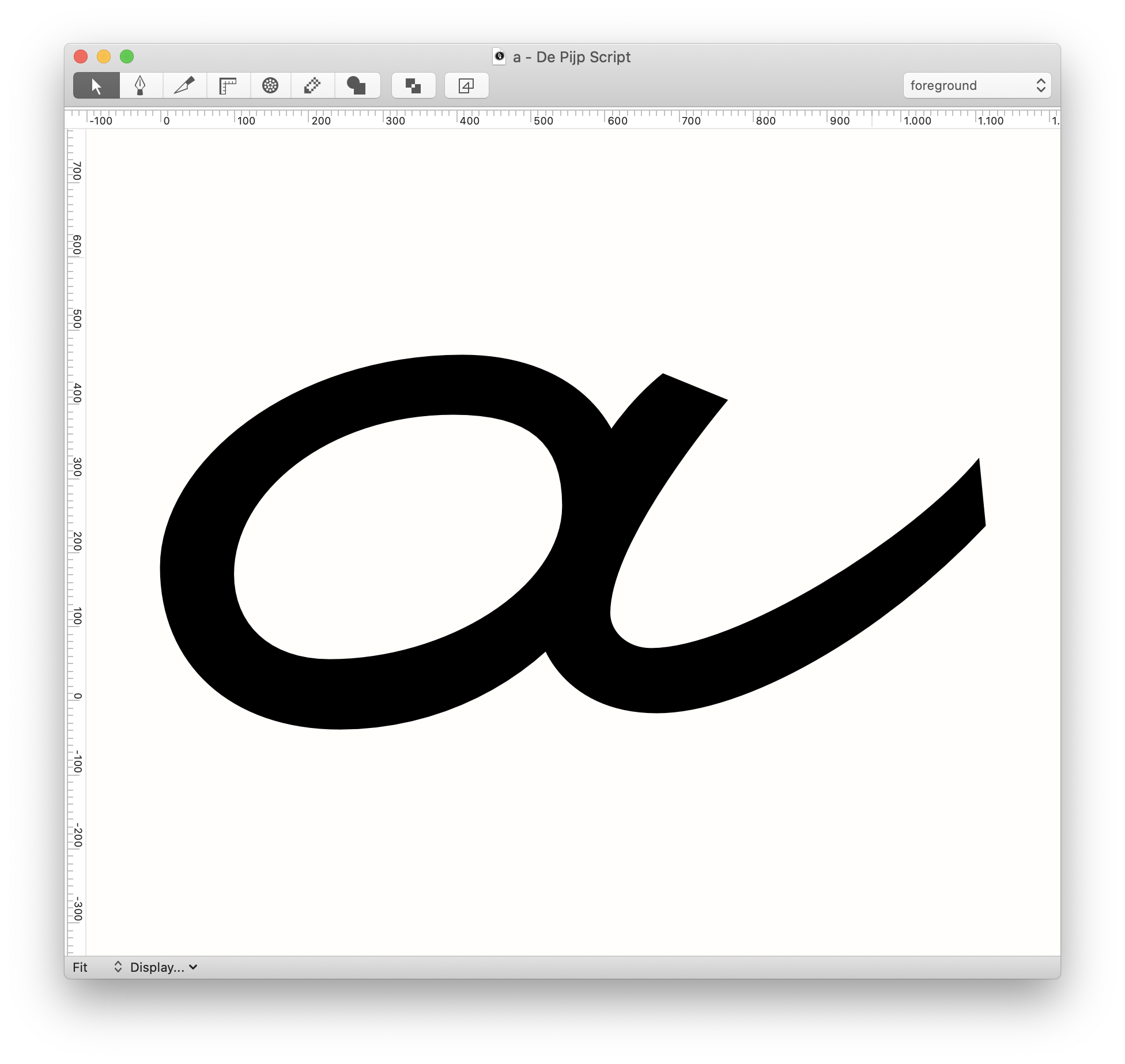
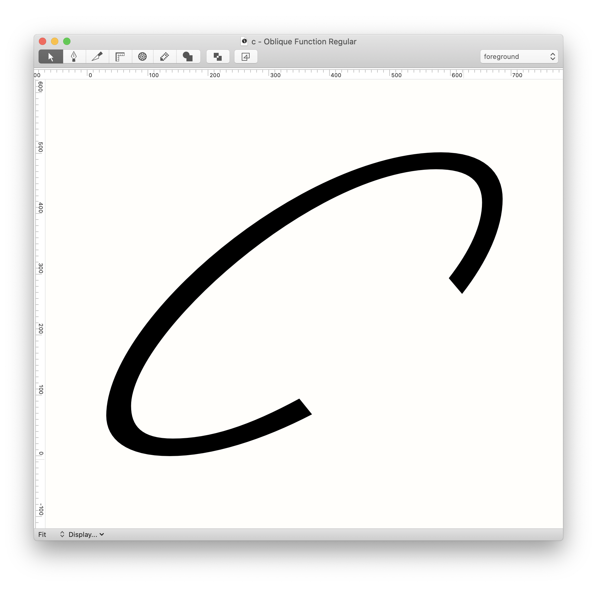
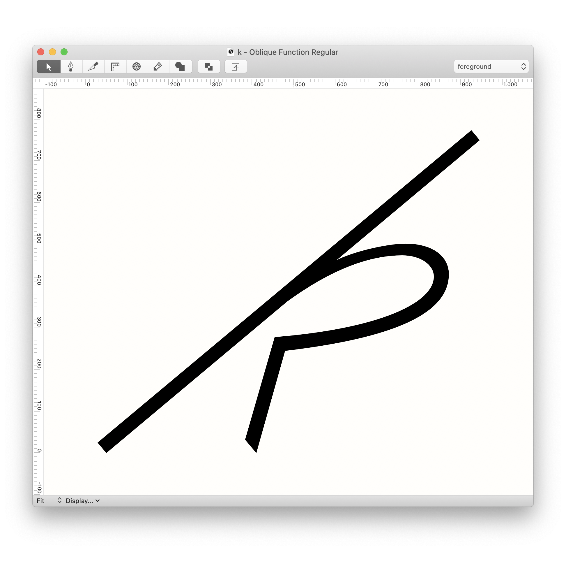
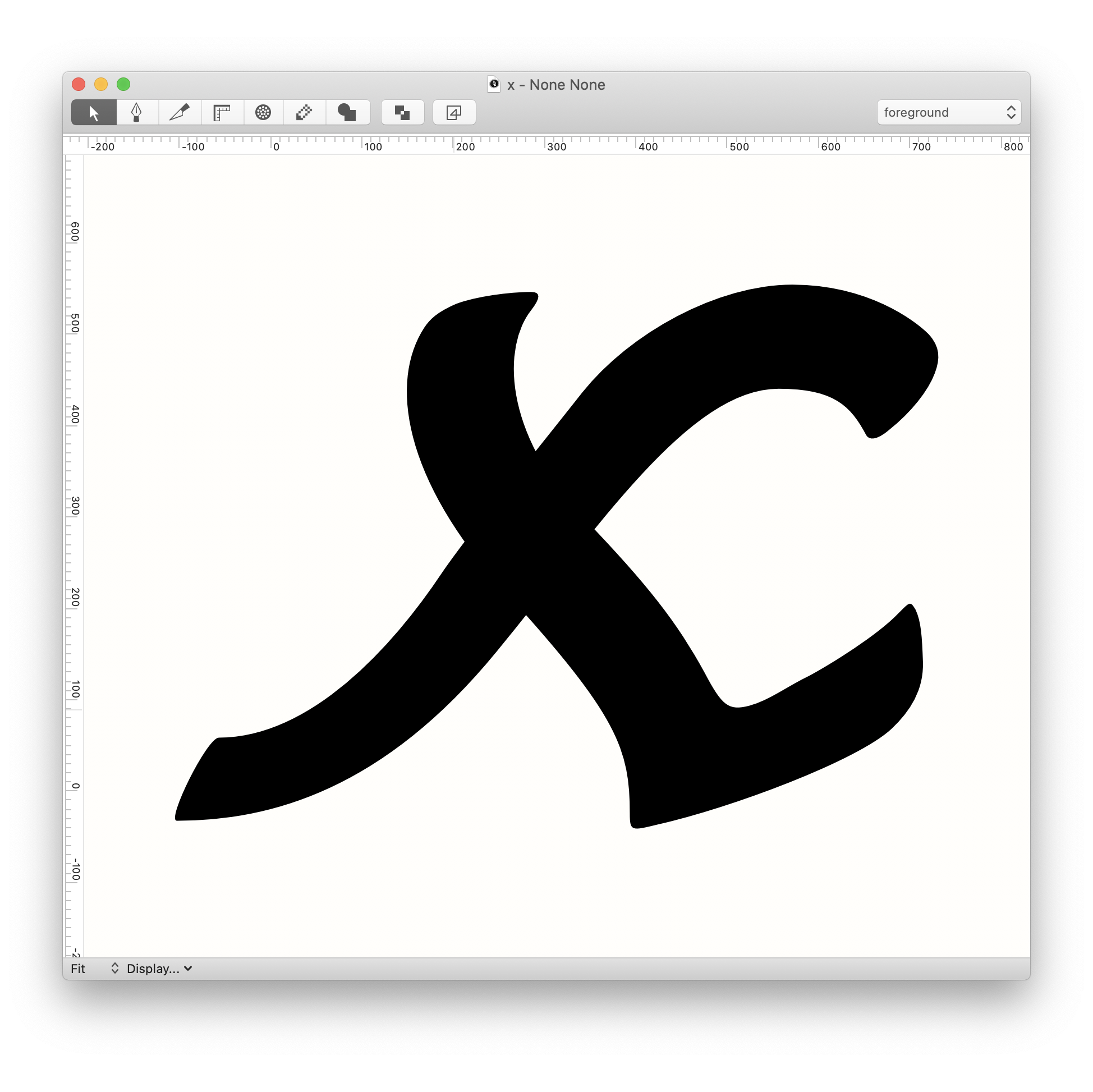
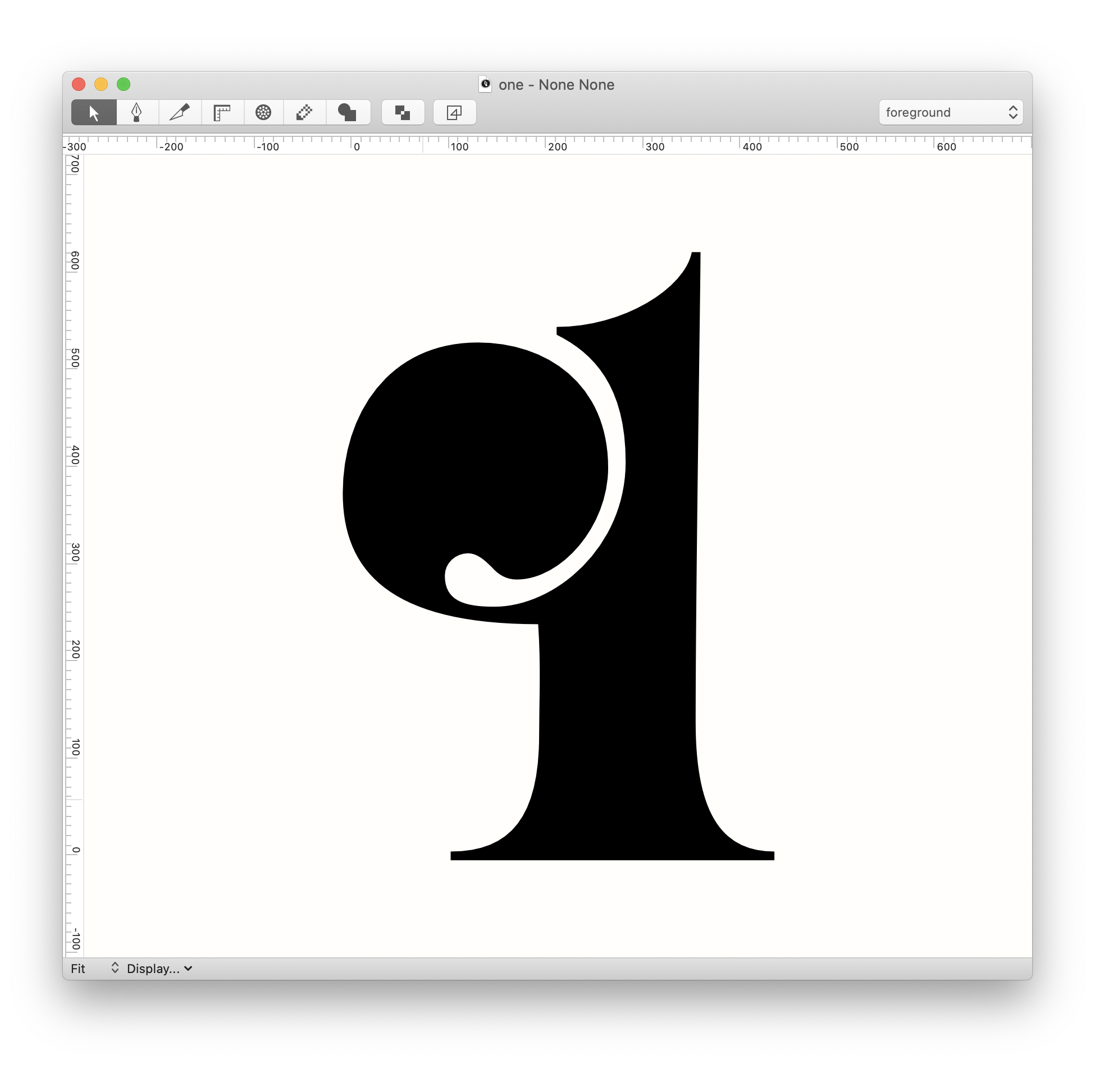
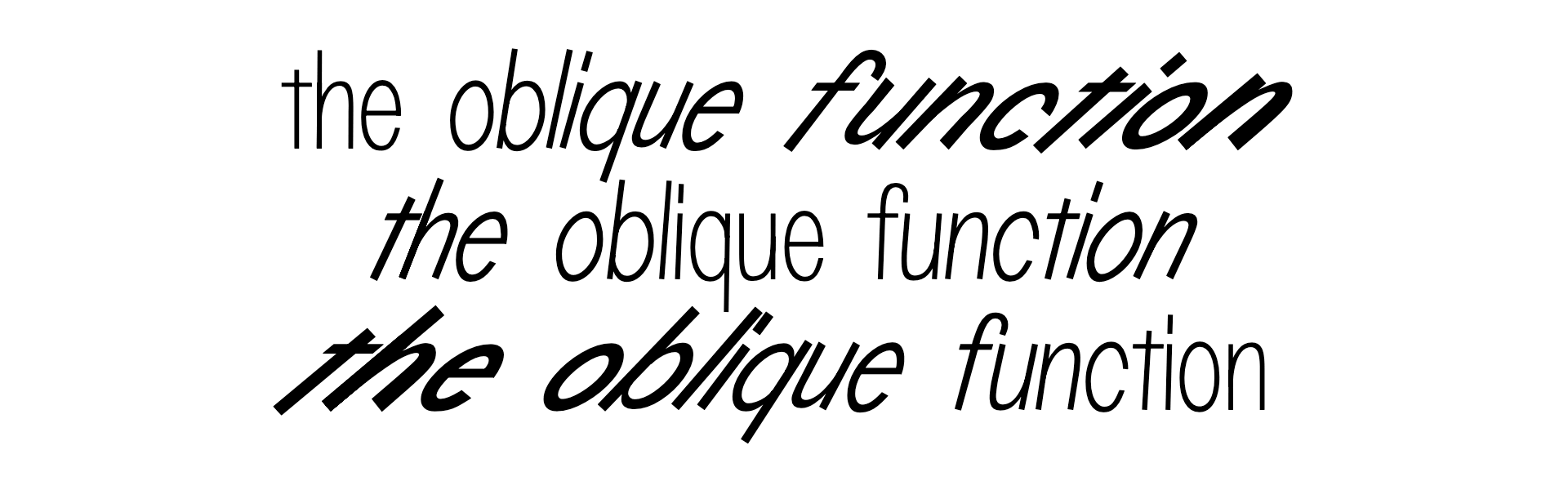
the oblique function
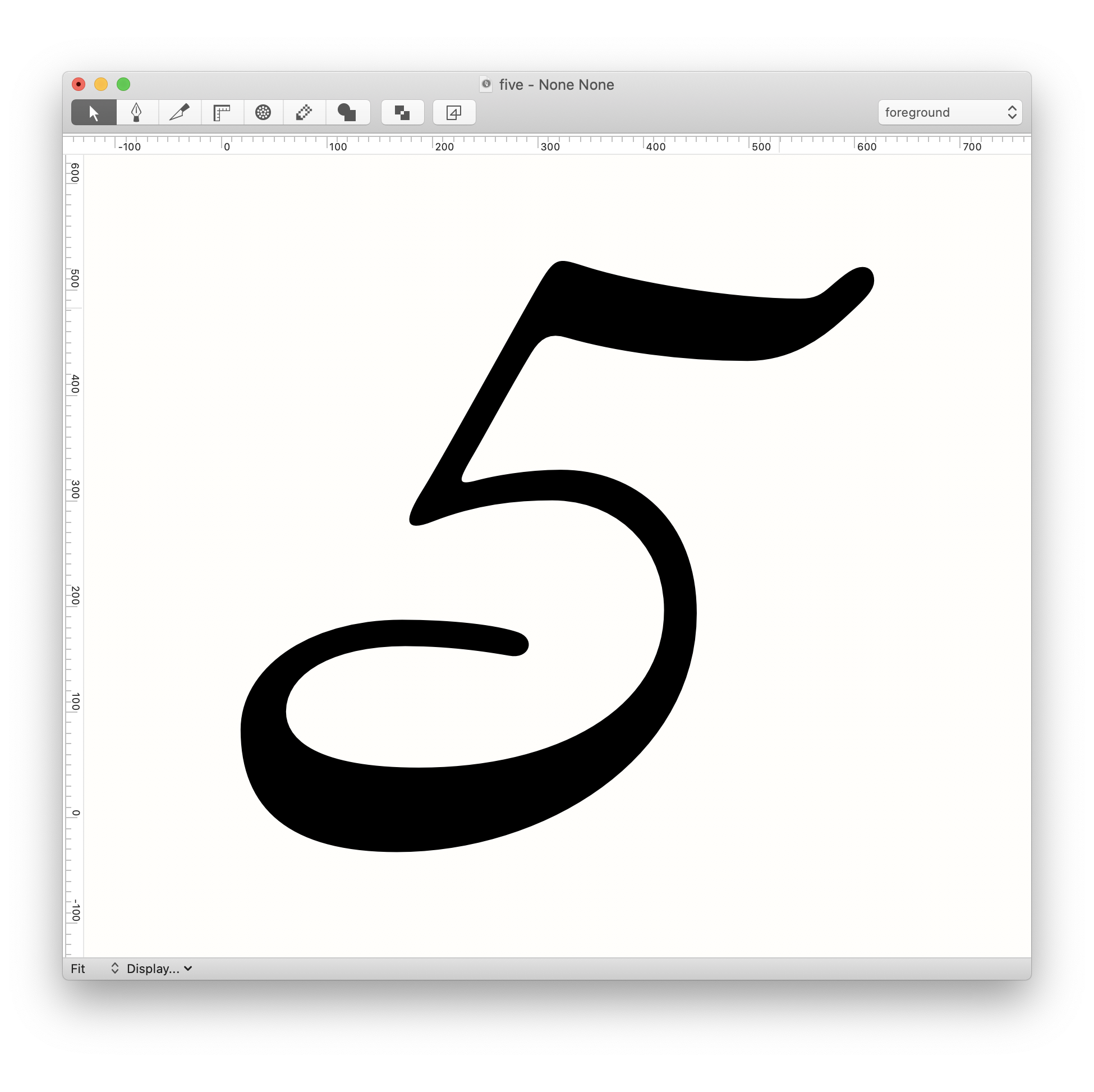
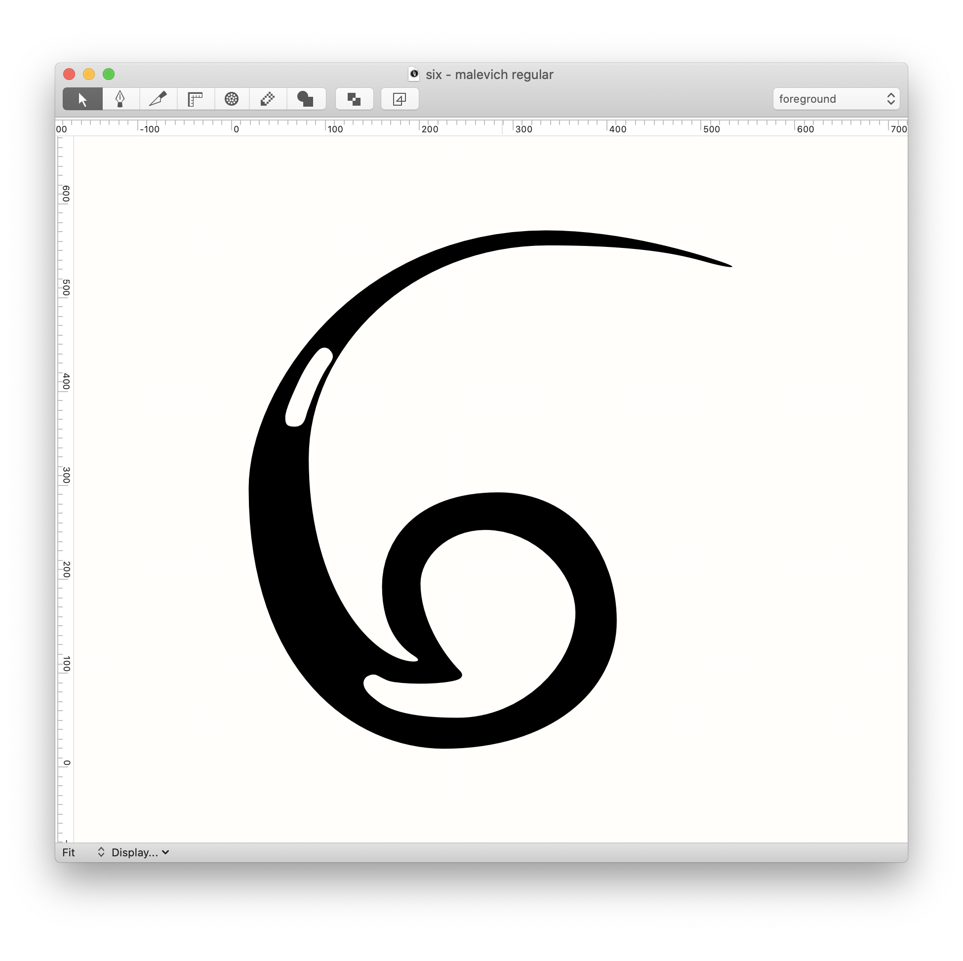
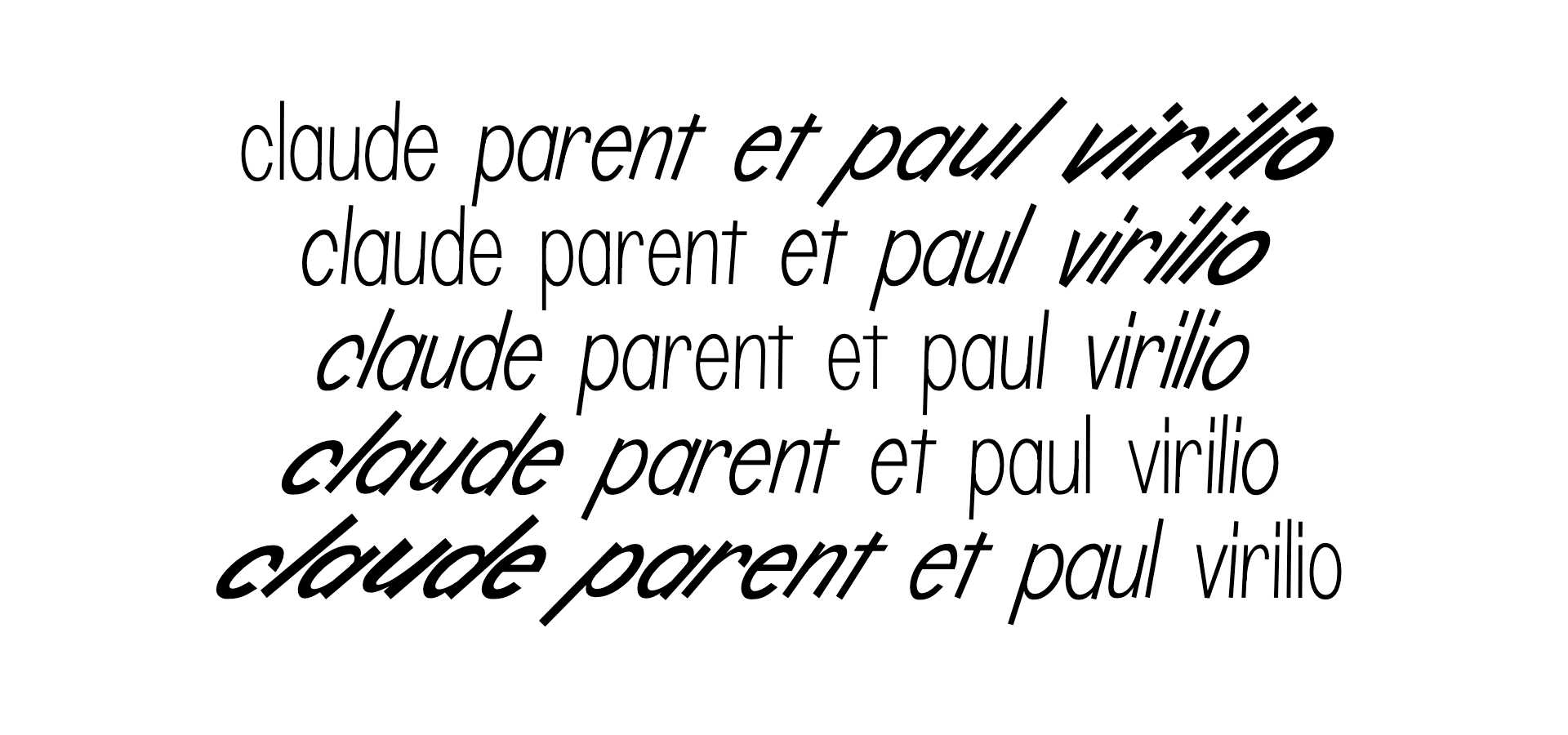
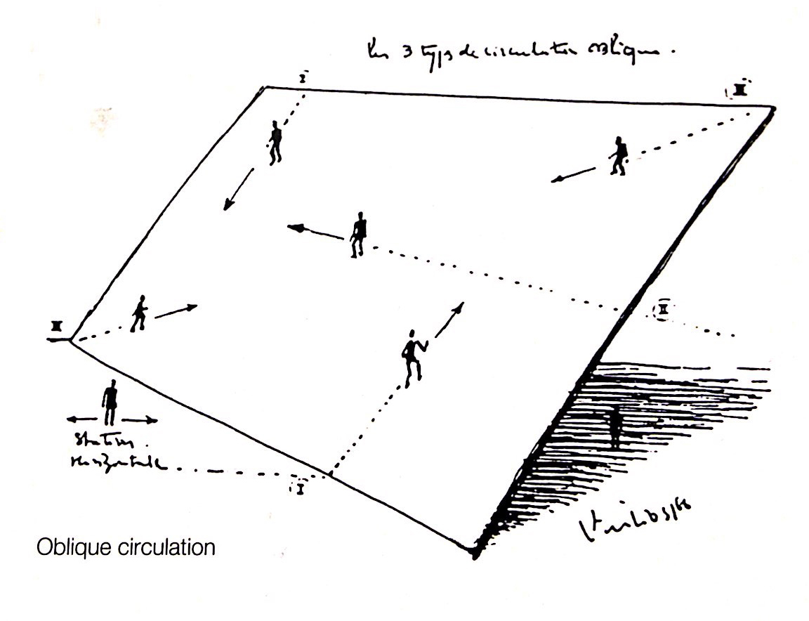
The Oblique Function is a philosophical theory in the field of architecture. It's first conceived and spread by Claude Parent and Paul Virilio, two french architects. The principal idea is that all vertical lines in an architectural plan are slanted. With this they want to make the person conscious of the space that he is standing in or the plane that he is moving on. Inspired by Disgust by Jean-Paul Sartre, they wanted to bring the idea and physical feeling of existentialism to the people in such a space, by means of architecture. In their research they found out that a person can still stand and move, without any outside help, on a plane that's slanted on an angle of fifty degrees. It's on that angle that the person is most aware and conscious of the plane he's standing on. I wanted to translate this idea to a typeface. In my research I started to skew existing fonts to see where there would appear problems concerning contrast, proportions, readability, etc. Based of of that research I drew letters on a fifty degree angle but tried to keep in mind the proportions, contrast, shapes, connections, etc. like it was a regular typeface. I named that style the regular as it would be the regular in this family. For the display style I skewed to regular style back to zero degrees. But because I drew them slanted the display style is filled with these weird and quirky letters. The interaction between those two styles is also playing with our consciousness of the shapes of letters.
The Oblique Function is a philosophical theory in the field of architecture. It's first conceived and spread by Claude Parent and Paul Virilio, two french architects. The principal idea is that all vertical lines in an architectural plan are slanted. With this they want to make the person conscious of the space that he is standing in or the plane that he is moving on. Inspired by Disgust by Jean-Paul Sartre, they wanted to bring the idea and physical feeling of existentialism to the people in such a space, by means of architecture. In their research they found out that a person can still stand and move, without any outside help, on a plane that's slanted on an angle of fifty degrees. It's on that angle that the person is most aware and conscious of the plane he's standing on. I wanted to translate this idea to a typeface. In my research I started to skew existing fonts to see where there would appear problems concerning contrast, proportions, readability, etc. Based of of that research I drew letters on a fifty degree angle but tried to keep in mind the proportions, contrast, shapes, connections, etc. like it was a regular typeface. I named that style the regular as it would be the regular in this family. For the display style I skewed to regular style back to zero degrees. But because I drew them slanted the display style is filled with these weird and quirky letters. The interaction between those two styles is also playing with our consciousness of the shapes of letters.
———————————————————
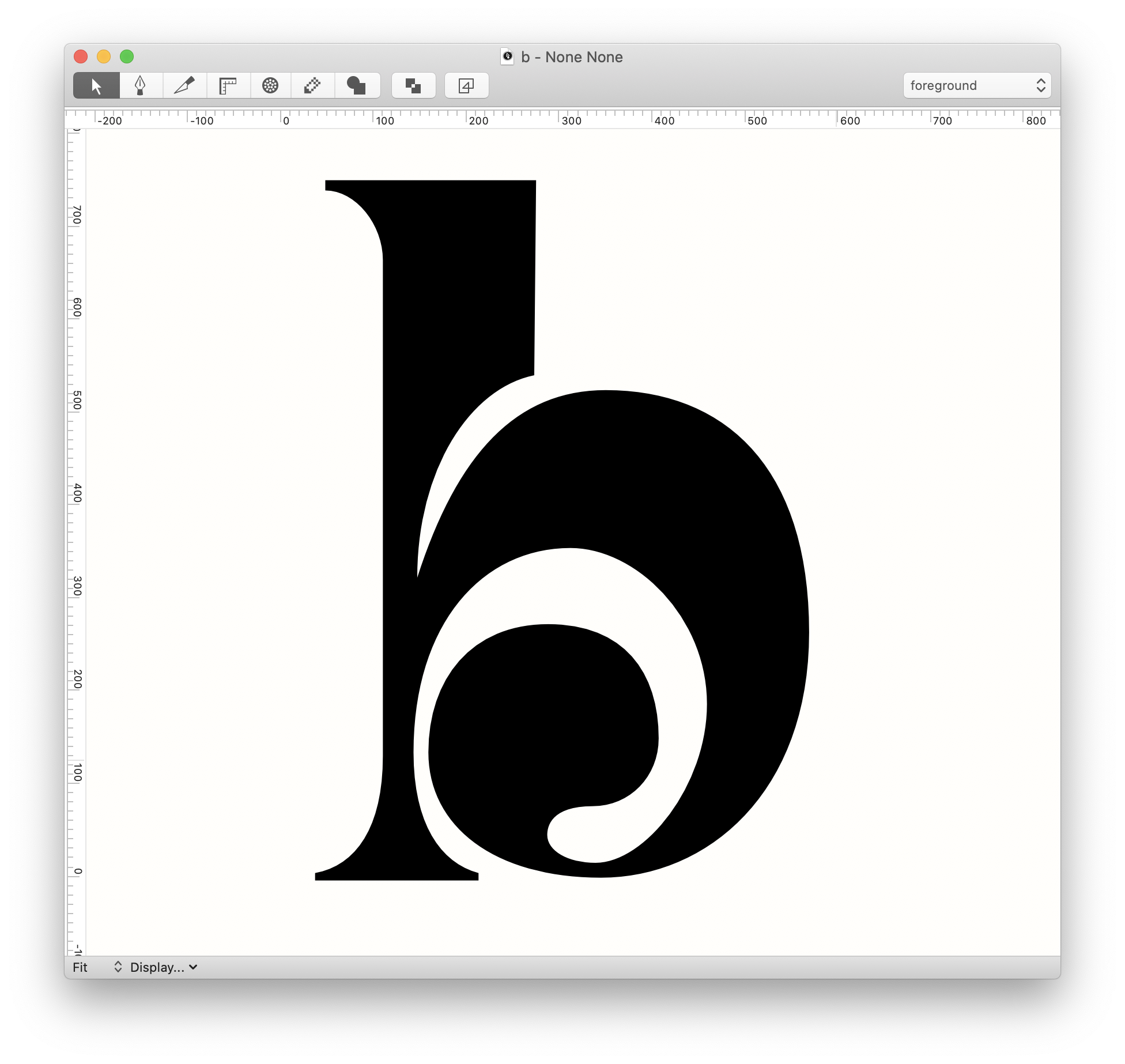
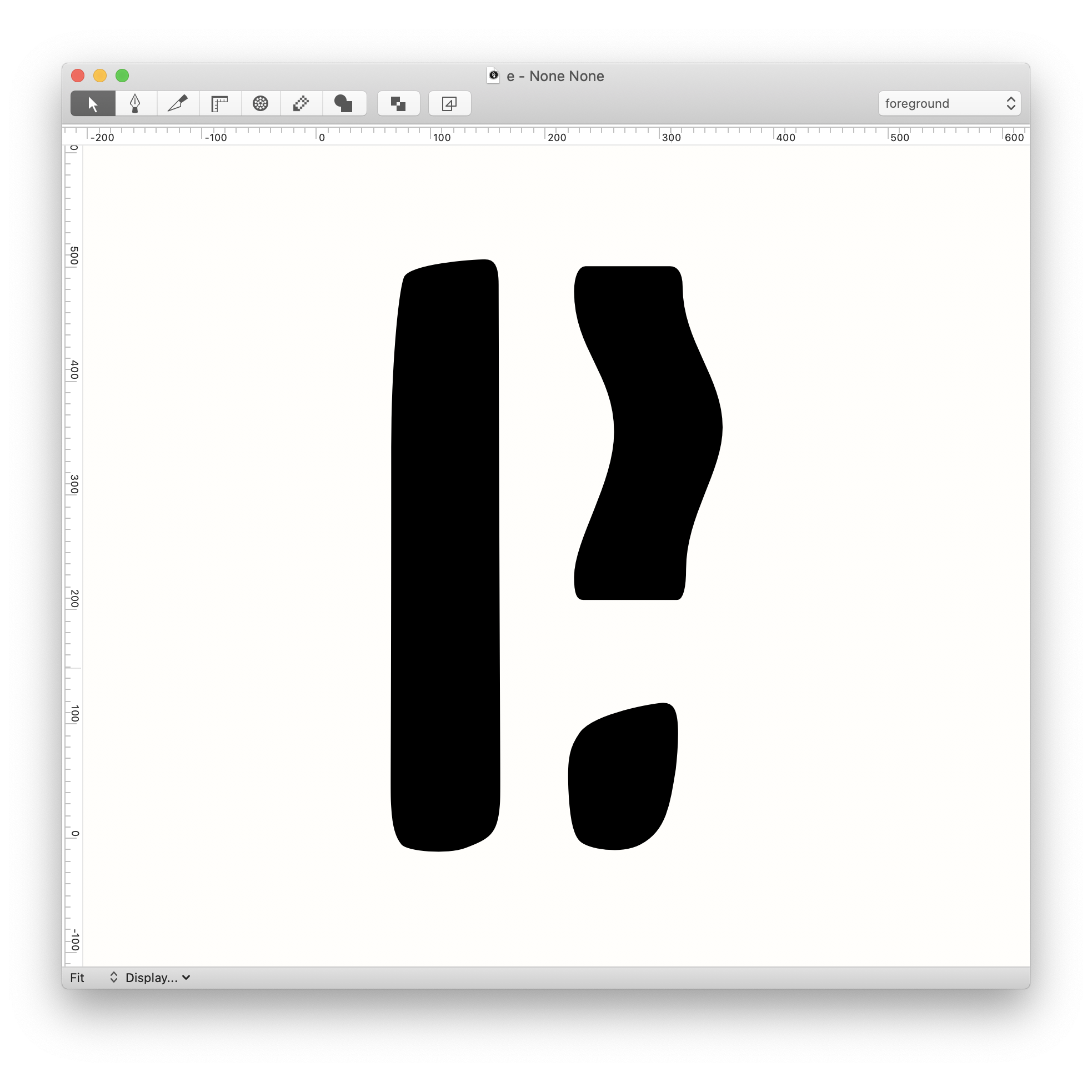
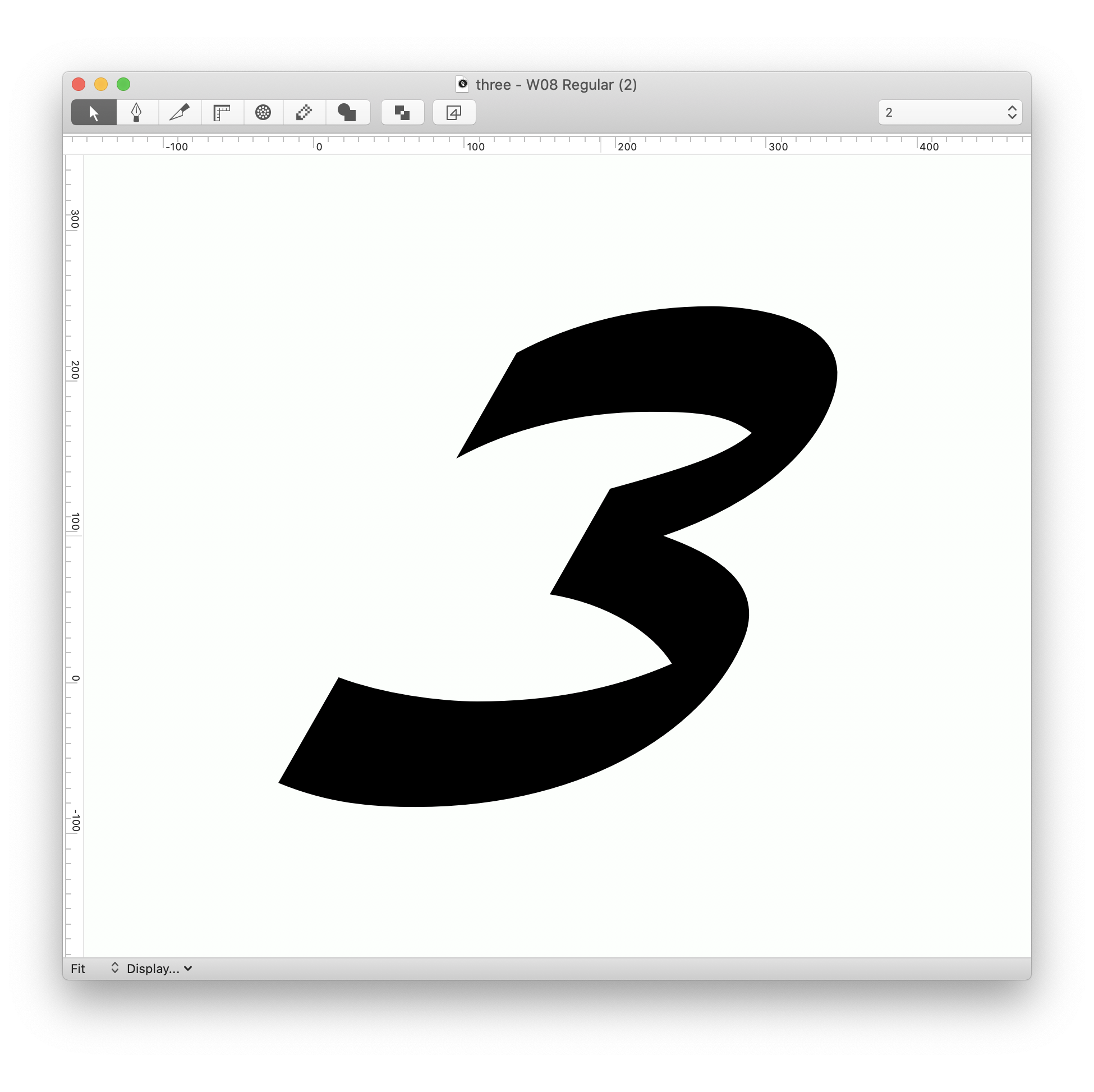
I developed this font for an assignment where we had to create an identity for multiple records and a poster. This identity was meant for the label Deutsche Grammaphon. I interpreted that label in the sense of the old versus the new, classic versus modern. What I did with that interpretation is that I made a mixture between the classic Bembo and the Modernistic Helvetica. At first I just sliced through the middle and pasted the two sides together. This resulted in the 5050 style. But I needed a more refined style so I started to polish the letters and make every transition smooth. I ended up with Merging Parts. The subtle transitions and changes in the letters are it's strength. Merging 5050 is the first step in the development of the Merging Family.
———————————————————
 ———————————————————


 ———————————————————